
There are lots of project management software available—each varying in features and complexity, but each helps you keep your team organized and on schedule.
In this guide, we’ll compare some of the best project management software that help you manage tasks, collaborate with your team, and manage resources.
Key project management features to look for
Consider these key features when evaluating the best software for project management:
- Project management: Task organization features like Kanban boards for visual project status and easy task reassignment
- Gantt charts: Visual project roadmaps showing tasks, timelines, assignments, milestones, and dependencies
- Resource management: Tools to allocate and track resource utilization, preventing overallocation and burnout
- Time tracking: Built-in time tracking for accurate billing and payments based on work completed
- Reporting and analytics: Dashboards to uncover trends, form insights, and guide decisions
- Collaboration tools: Features supporting seamless communication among team members
- Integrations: Extend functionality by linking with other software, enabling streamlined workflow
Considerations when selecting the best project management tool
Every tool has its strengths and weaknesses. Consider the specific needs of your team and projects when selecting a project management tool. Some key considerations include:
- Team size: Different tools cater to varying team sizes—if you’re a small team, you may only need straightforward task management. Larger teams might need more advanced features like resource allocation and project cost management.
- Industry: Select a tool that aligns with your industry’s best practices and specific requirements. For example, marketing agencies will need a project management tool to manage client retainers.
- Flexibility vs structure: Agile teams may prefer tools with Kanban boards and iterative planning features, and traditional projects may benefit from visual project planning using Gantt charts.
- Budget: Consider upfront costs, long-term value, scalability, and additional expenses when assessing pricing models.
- Ease of use: A tool’s ease of use directly impacts your team’s adoption rates and overall productivity. Look for an easy-to-use tool for smooth team adoption and increased productivity.
Project management tool comparison: 11 popular software to consider
Now, let’s run through some of the best project management tools.
1. Scoro
Scoro is an all-in-one work management system build for agencies and consultancies. It combines project and work management with time tracking, invoicing, and financial reporting. It offers a centralized platform for consultancy and agency firms.
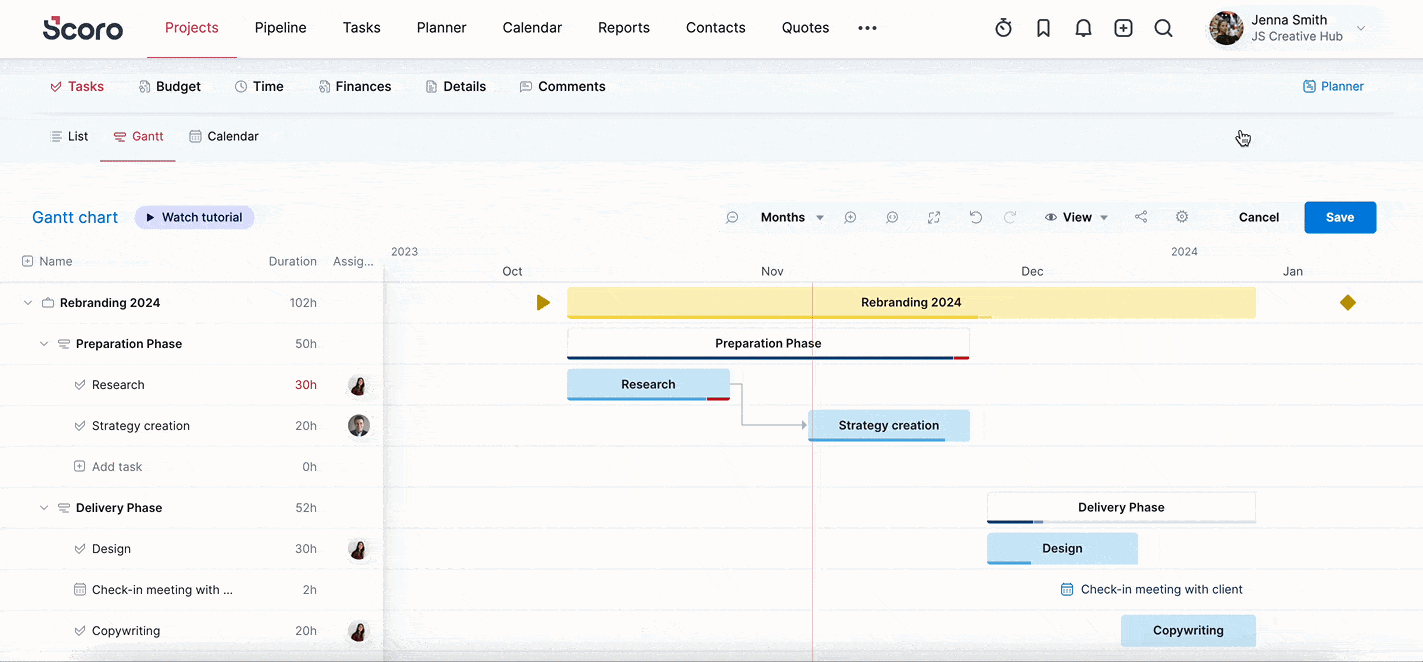
You can use the “Gantt” tab for each project to plan out tasks and milestones, track project progress, and identify timeline discrepancies. If certain tasks run over time, you can easily adjust deadlines and replan on the go to respond to changes and keep the project on track.
Equally powerful, Scoro’s “Budget” tab gives you insights into a project’s time and monetary data. For example, the “Burn-up” chart shows your project’s time budget consumption over time. Helping you monitor the rate at which your team utilizes the allocated hours for the project.
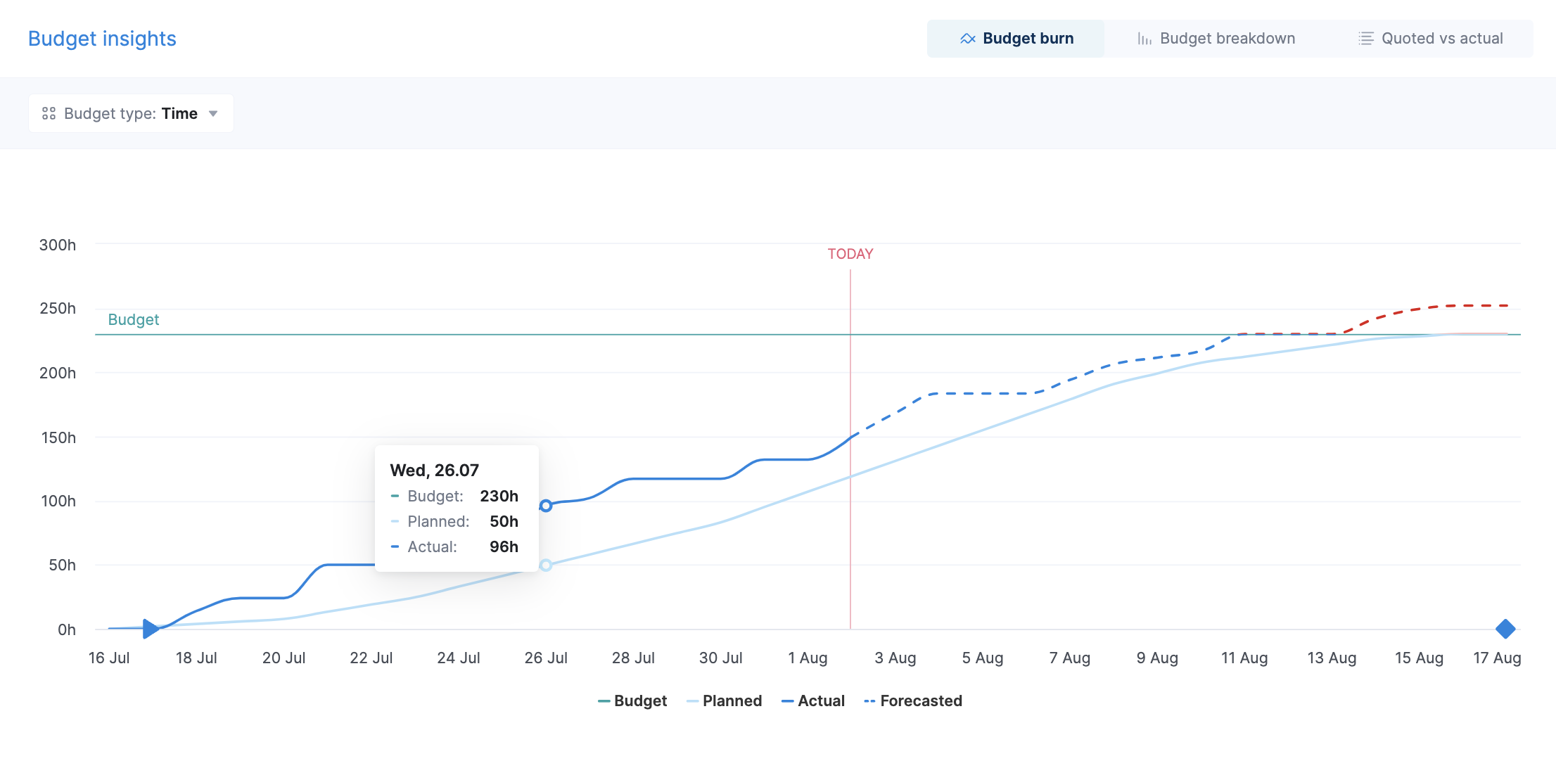
The chart is always visible in the “Budget” section and shows data as soon as you have set a start and an end date for the project or planned some tasks.
For a deeper dive into project financial data, the “Quoted vs Actual” table within the same section offers granular insights into real-time project profitability.
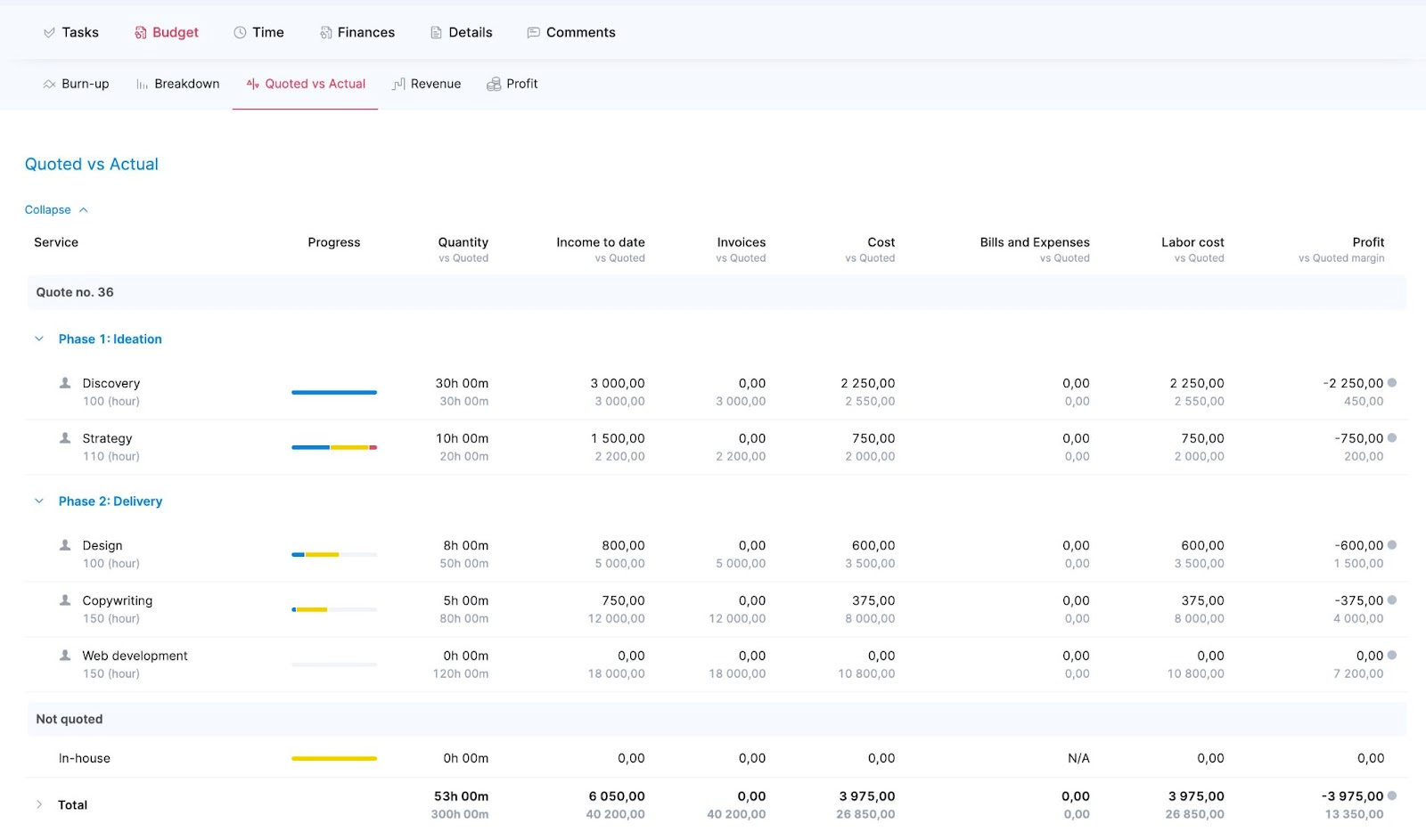
It helps you to track:
- how many hours worth of budget you still have left
- whether completed work has been invoiced and payments received
- how much you’ve already spent and whether each service is progressing within budget
- how much profit the project has generated, i.e. whether you got the expected margin for each service or should you adjust your price or time estimates next time
All this project-level time and financial data can help you better understand estimated versus actuals in real-time. Helping you fight scope creep and reallocate resources smartly to stay within the budget.
What you’ll love
The portfolio management feature helps you monitor and manage multiple projects simultaneously.
The “Project list” view gives you an instant snapshot of progress, income, labor costs, external costs, project profit, and status at a glance.
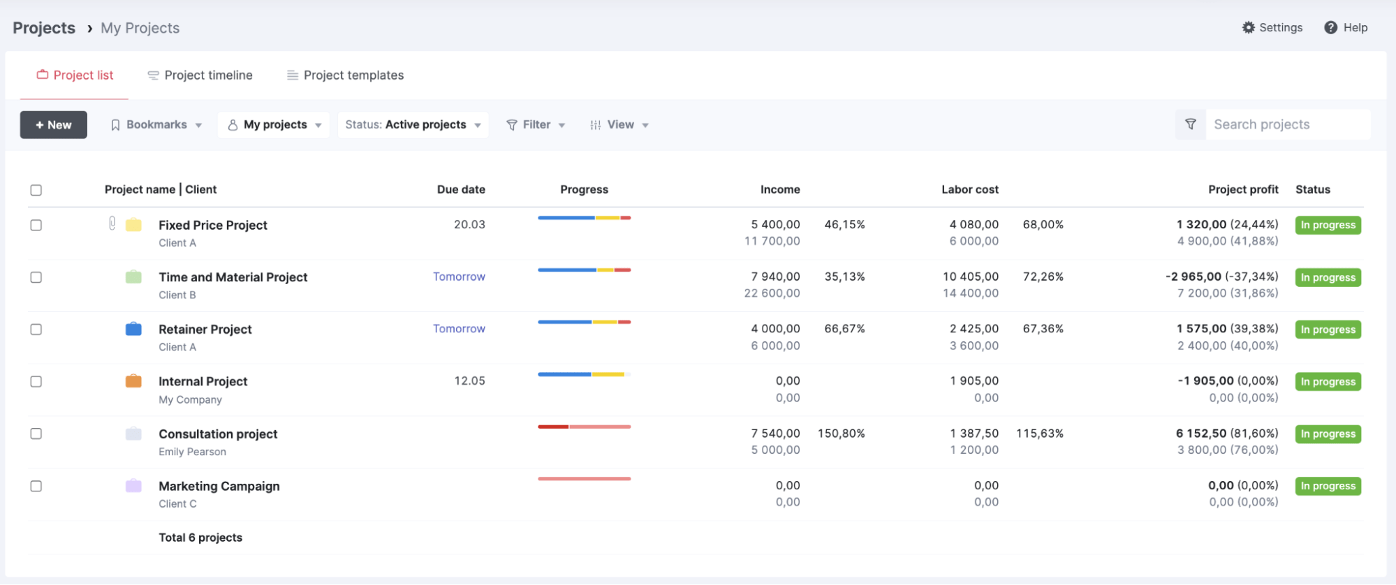
You can filter and group the list in various ways to slice it and dice data whichever way you want to (e.g. by status, clients, project managers, dates, tags, etc).
You can also use the “Project timeline” tab to gather all your future and in-progress projects into one visualized graph to give you the ability to zoom out and see the bigger picture.
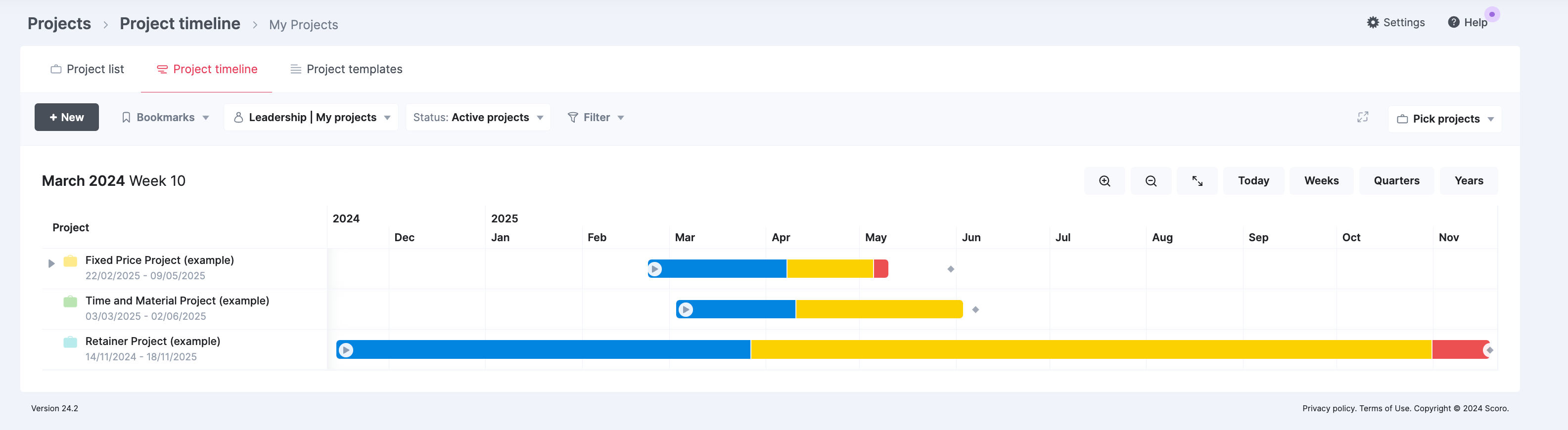
All your projects automatically appear on the “Project timeline.” The left-hand side of the table displays all selected projects along with their start dates, end dates, and deadlines.
Core features of Scoro you’ll like
- Retainer agreements for ongoing collaborations with clients by setting up long-term agreements
- Project quote builder to create accurate project cost estimates based on phases and tasks
- Team labor rates for precise project budgeting and profitability analysis
- Project expense management to help you keep costs under control
- Resource tools to help you accurately forecast and balance workloads
- Time tracking and timesheet options for keeping an eye on where your team time is going
- Sales CRM dashboard to keep track of client proposals
- 50+ report templates to analyze various aspects of project performance, including productivity, utilization, revenue, and profitability
Pricing
Scoro has four plans:
- Core: $19.90 per user per month
- Growth: $32.90 per user per month
- Performance: $49.90 per user per month
- Enterprise: Contact sales for pricing
You can also try Scoro free for 14 days.
2. ClickUp
ClickUp is an all-in-one project management and collaboration platform that brings teams closer together with connected workflows, docs, and real-time dashboards.
The platform provides tailored views for cross-functional projects to allow your team to visualize their work in various ways, including Gantt charts, timelines, lists, boards, and calendars.
Like Scoro, the “Gantt” chart view can help you easily map out project roadmaps with interactive timelines.
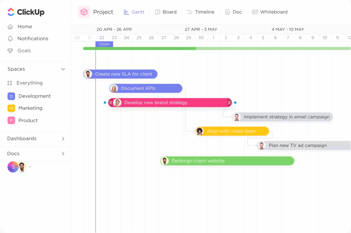
Here, you can manage dependencies, get progress percentages, make bulk edits, and reschedule groups of tasks.
For example, let’s say you’re managing a software development project using a Gantt chart. The project involves multiple phases, such as design, development, testing, and deployment. Each phase consists of several tasks assigned to different team members.
You realize that the design phase is taking longer than expected, and you need to adjust the start dates and durations of the associated tasks in bulk.
You can do this without leaving the “Gantt” chart view by:
- Hovering over the tasks you’d like to edit
- Clicking the task selector on the left side
- Use the “Multitask Toolbar” to make your edits
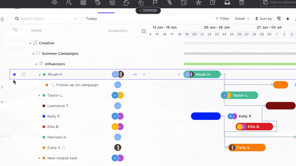
You can perform a number of actions on selected tasks, such as setting watchers, assignees, status, tags, start and due dates, priority, task types, milestones, dependencies, and custom fields.
ClickUp also makes project management easier with customizable dashboards and views to track project progress and keep an eye on your team’s productivity in real-time.
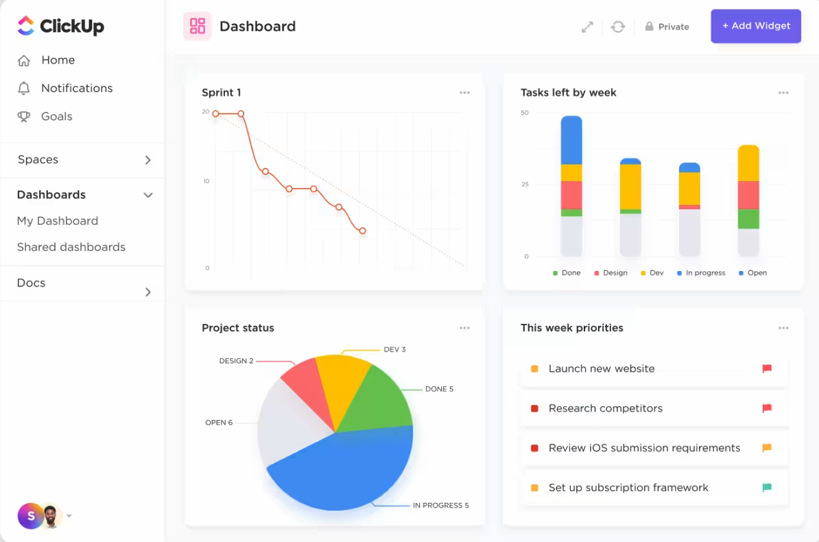
You can build fully customizable dashboards to gain high-level overviews and deeper insights into your projects. You can choose from over 50 widgets to create the perfect dashboard for your needs.
For example, use project dashboards to:
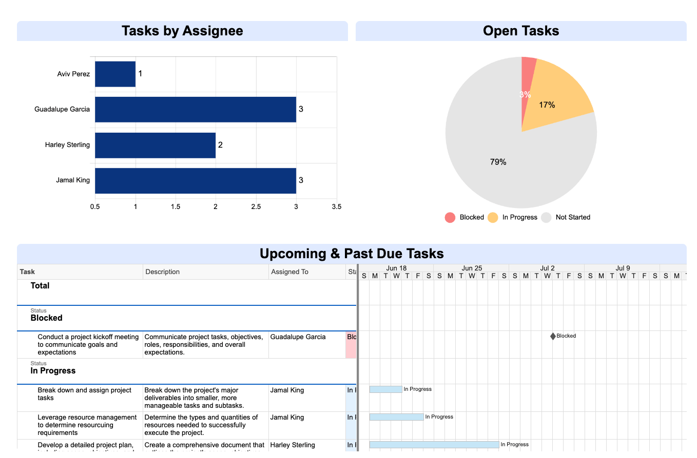
- Create a dashboard to provide a high-level overview of a project’s progress. Include widgets like a timeline displaying key milestones, a bar graph showing the percentage of tasks completed in each project phase, and a list of upcoming deadlines.
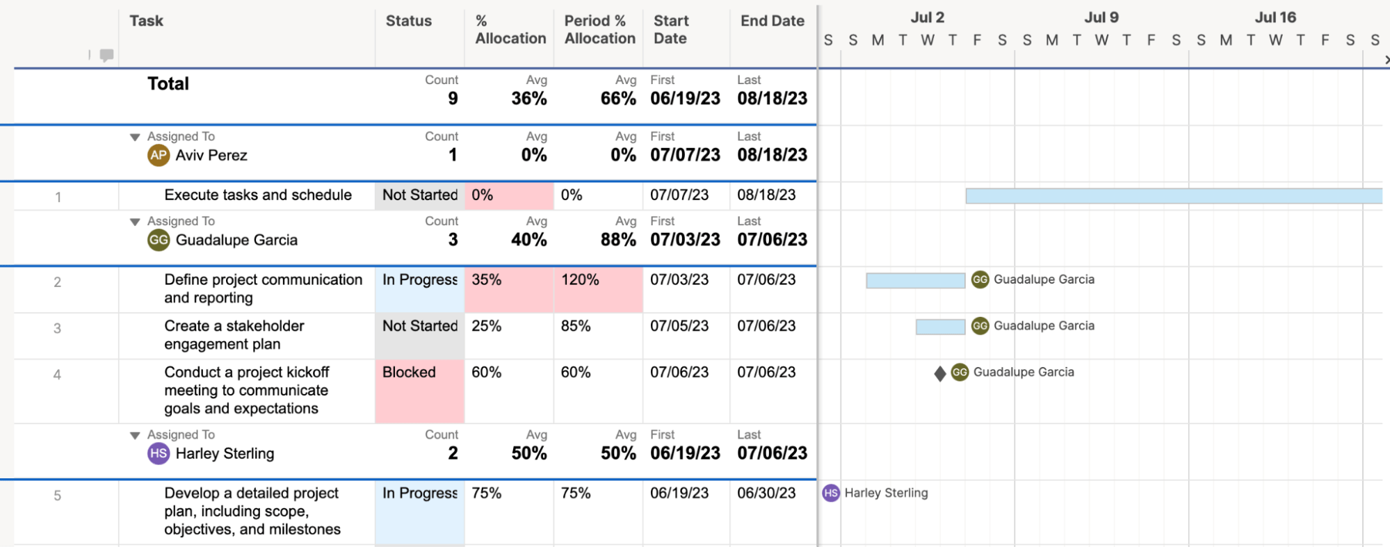
- Create a dashboard to visualize how resources (e.g., team members, equipment, budget) are being allocated across projects. A table widget displays project names, assigned resources, and allocation percentages.
- Build a dashboard to track progress against key goals and objectives. Use widgets like a goal progress bar showing each goal’s completion percentage and a line graph visualizing goal progress over time.
What you’ll love
ClickUp’s advanced automation capabilities streamline workflows by setting custom actions and triggers.
Access the “Automations” menu within a “Space,” “Folder,” or “List,” selecting from pre-set templates or creating custom workflows to meet the unique demands of your project.
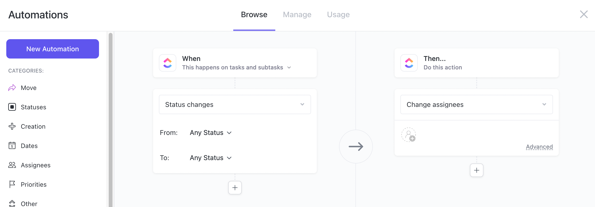
Choose from 100+ pre-built automations to create new tasks and implement clear SOPs across your team quickly. Customize these automations based on your needs; your team can concentrate on what matters most.
For example:
- Escalate the priority level of a task if it remains incomplete past a certain deadline
- Send automatic notifications to stakeholders when a task status changes
- Assign team members to new tasks based on their roles
Core features of ClickUp you’ll like
- Tasks to manage and organize project tasks and backlogs
- Docs to collaborate on project documentation and notes
- Whiteboards to brainstorm and visualize ideas with the team
- Permissions to control access and visibility for different team members
- Automations to streamline workflows and reduce manual work
- Custom views to create personalized views of project data, such as Lists, Boards, and Gantt charts
- Forms to capture project requests, feedback, and surveys using customizable forms
- Dashboards to get a high-level overview of project progress and key metrics
Pricing
ClickUp has four plans:
- Free
- Unlimited: $7 per user per month
- Business: $12 per user per month
- Enterprise: customized enterprise pricing
3. Monday
Monday is a comprehensive project management tool with features like goals, resource management, Gantt charts, and reports to help teams plan, execute, monitor, and evaluate their projects.
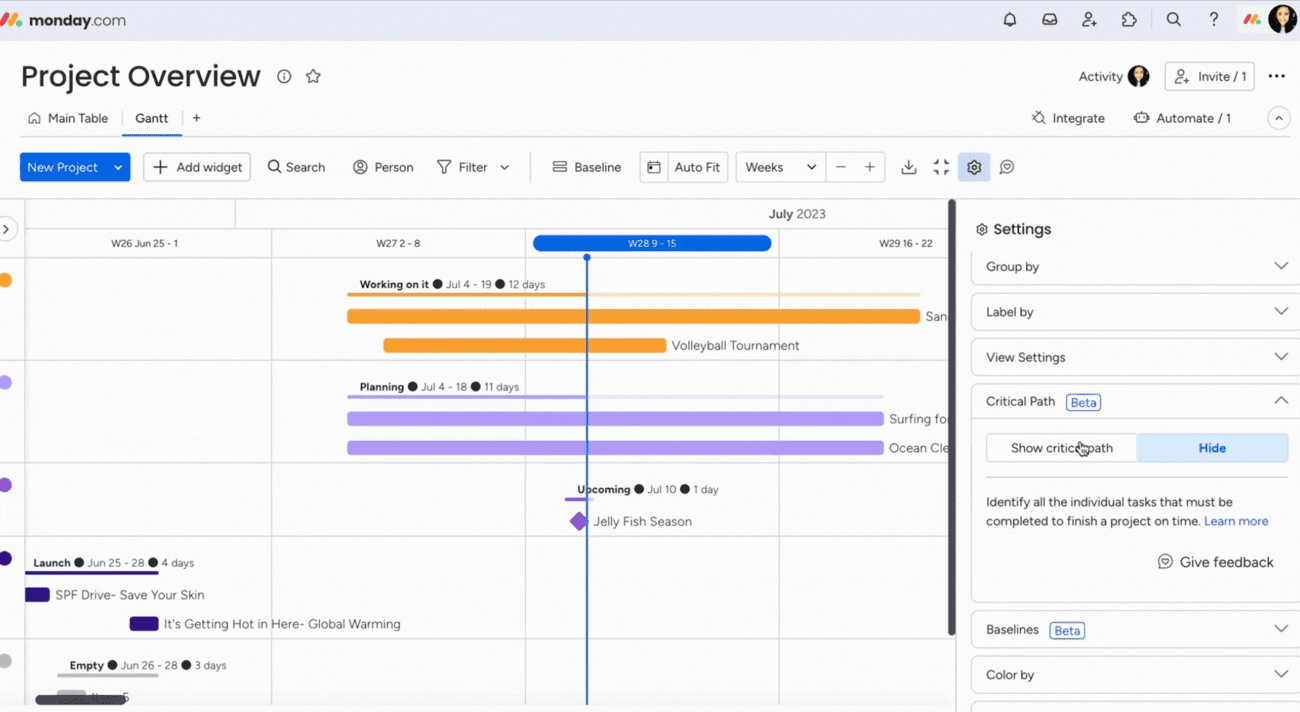
Monday also utilizes Gantt charts to help you visualize project tasks, milestones, and dependencies within a set timeline.
The “Gantt” view provides an at-a-glance understanding of your project’s status and details and makes it easier to identify potential bottlenecks and overlaps in the schedule.
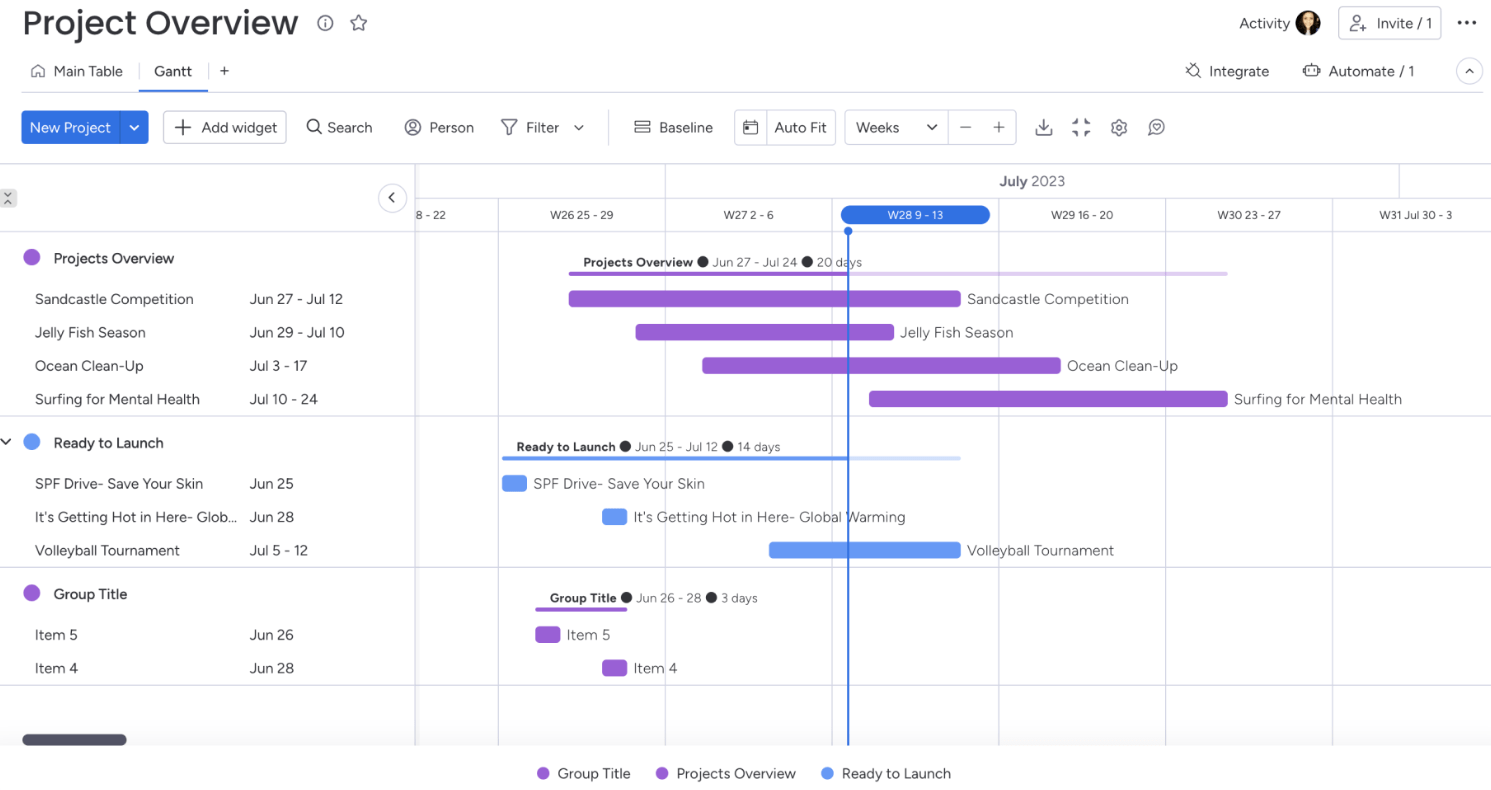
The “Dependencies” feature visualizes dependencies between your items with arrow lines. Identify tasks that are behind schedule and are preventing the project from being completed on time.
The arrows highlight the connections between tasks, but you can easily remove them with the click of the “Show Dependencies” option in the “View Settings” section in “Settings.”
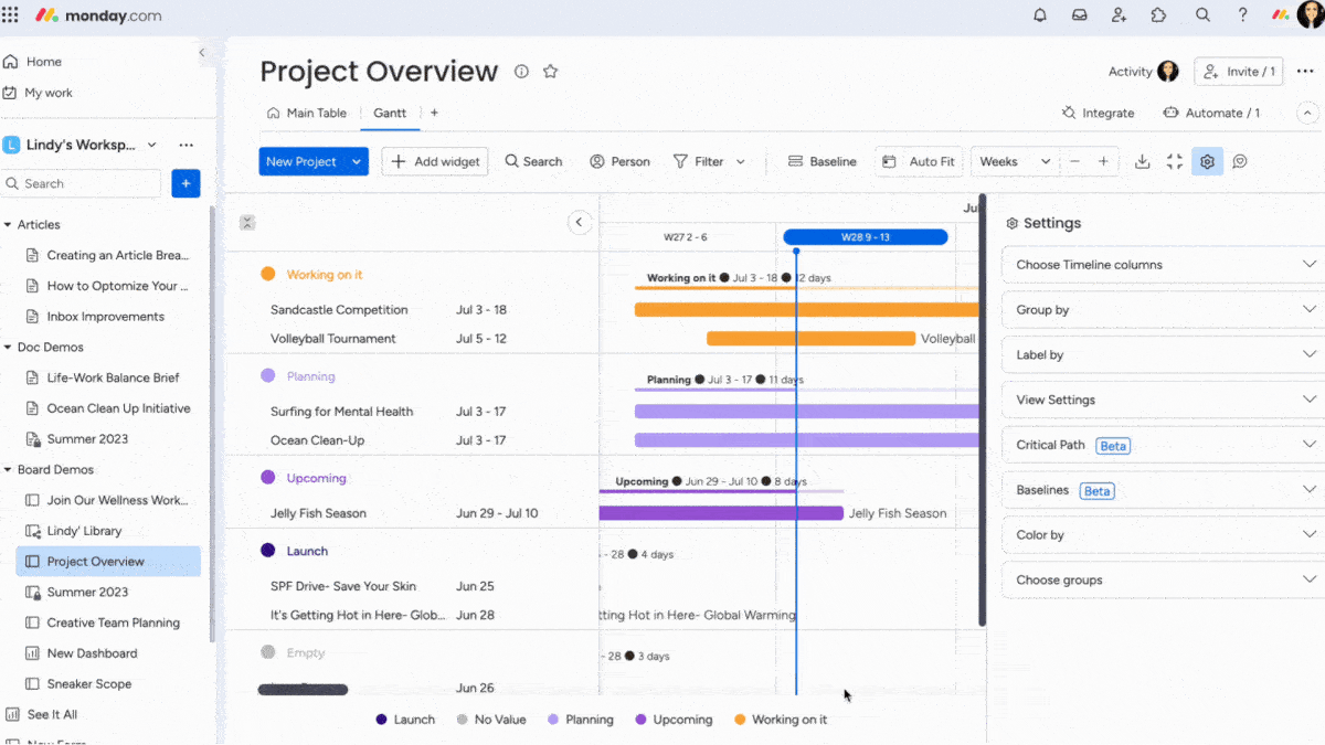
For example, use “Dependencies” to immediately see how a delay in a new website project’s design phase could push back the coding phase’s start. Use this info to reallocate resources or adjust timelines to mitigate the impact on the project completion date.
Minimize project risk further with the “Critical Path” overlay and identify all the tasks your team needs to complete to finish a project on time.
To add the critical path, click on the cogwheel in the upper right corner of your Gantt. Scroll down to “Critical Path” and select “Show critical path.“
What you’ll love
Monday integrates with over 200 apps. Integrations with tools like Slack, Gmail, GitLab, Excel, DocuSign, and Google Drive make it easy to access everything in one place.
To add an integration, open “Monday Marketplace” and select the tool you want to connect.
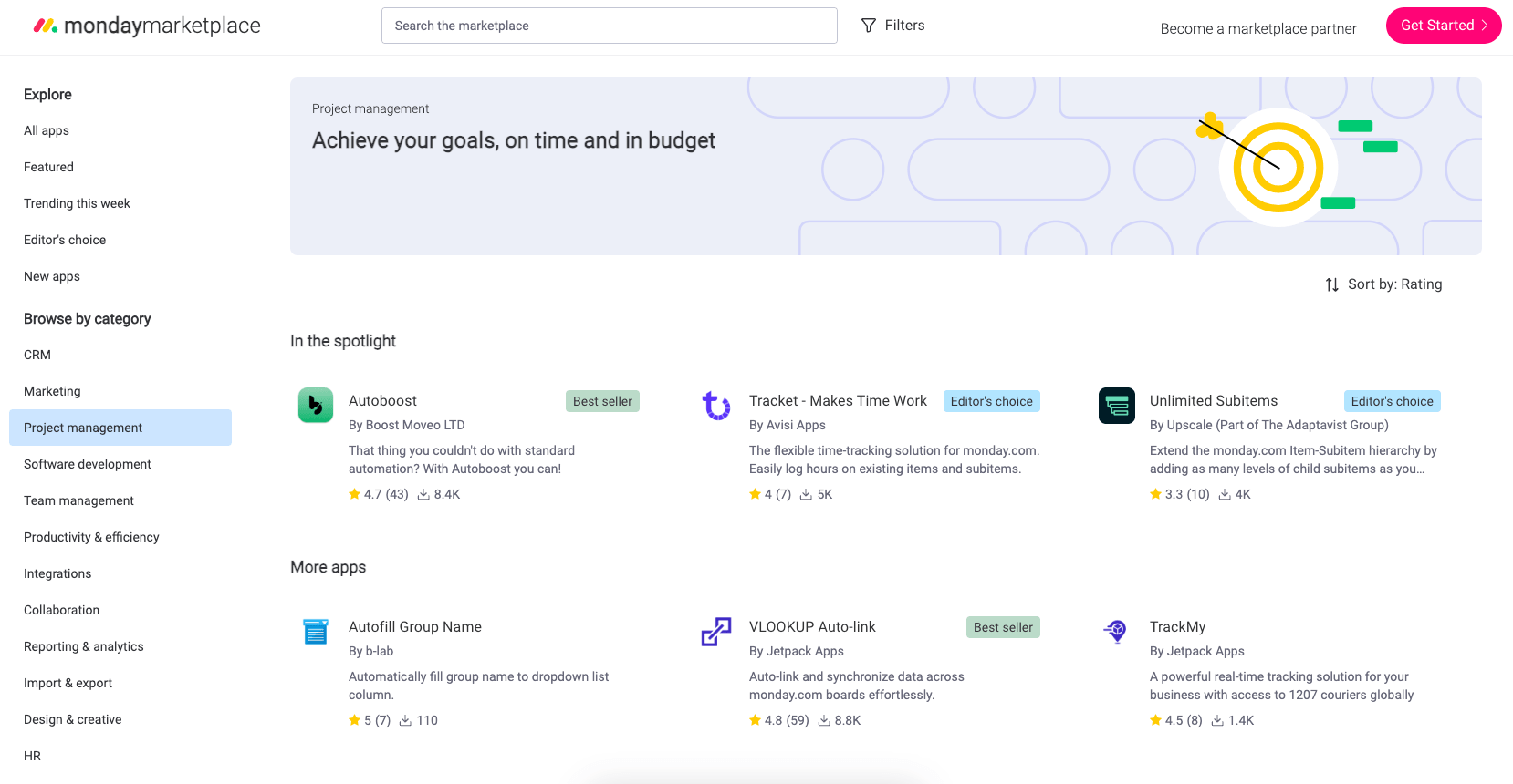
For example, integrate your board with:
- Slack to automatically post updates in a team channel when a task’s status changes. Keep your team informed and engaged without needing to leave their communication platform.
- Miro to streamline brainstorming and planning processes. Directly embed interactive Miro boards within tasks or projects.
- Crunchbase to enrich your business and market research. Pull detailed company information, funding rounds, and key people directly into your Monday.com board.
Core features of Monday you’ll like
- Customizable workflows to plan, execute, and track all kinds of work, from simple tasks to complex projects
- Multiple views, including Kanban boards, Gantt charts, calendars, timelines and more, to visualize work in different ways
- Dashboards to get high-level overviews, track progress, and gain insights across projects, teams, and departments
- Integrations with popular tools and apps to connect work across the organization
- Collaboration features like discussions, mentions, file sharing, and real-time messaging to enable teamwork
- Automations to streamline repetitive tasks, reduce manual work, and enforce processes
- Resource management to allocate resources, balance workloads, track utilization, and prevent burnout
- Project budgeting to create project budgets, track expenses, and monitor profitability
- Custom fields and forms to capture project information, requests, and data in a structured way
- Mobile apps to access work and update status from anywhere
Pricing
Monday has five plans:
- Free
- Basic: $9 per user per month
- Standard: $12 per user per month
- Pro: $19 per user per month
- Enterprise: customized enterprise pricing
4. Asana
Asana is another leading project management platform enabling teams to plan, organize, track, and manage work with flexible visual project views to suit each team’s needs.
Projects can be organized as boards, lists, timelines, calendars, or Gantt charts for deadline-driven tasks or ongoing operations.
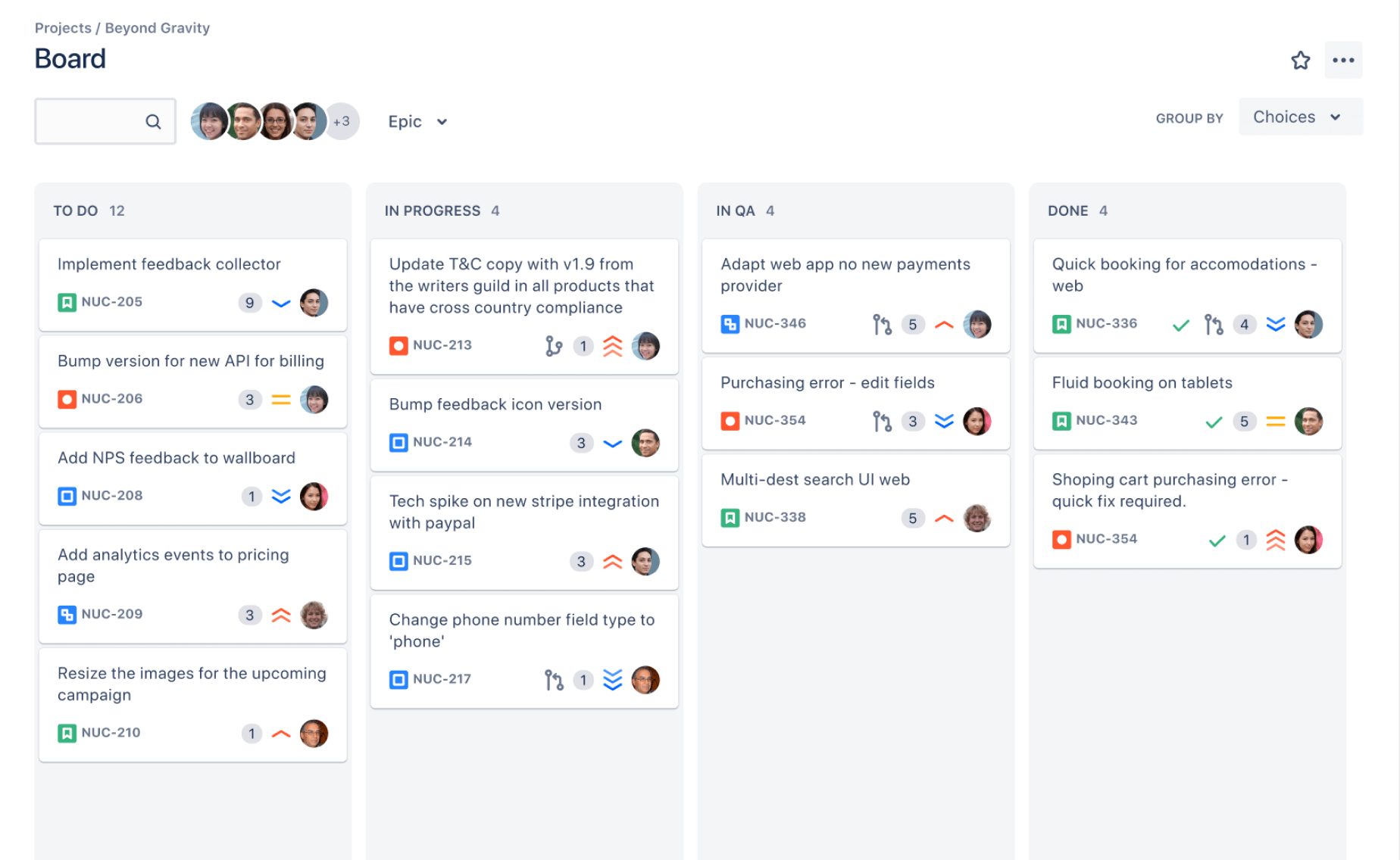
For example, the “Board” View presents tasks as cards on a Kanban board. Organize work like sticky notes that you move from one stage to another. Customize the list with labels like “New,” “In Progress,” and “Complete” to suit your workflow.
This helps teams to map their process by defining columns for each work stage. Team members can then drag and drop tasks between columns as they progress.
The “List” view provides a more traditional task list approach, where teams can capture every project step from start to finish.
Customize this view further with drag-and-drop functionality to:
- Reordering tasks in a project
- Filtering or sorting your tasks
- Adjusting your project view to show incomplete, completed, or all tasks
For more time-sensitive projects, “Timeline” and “Calendar” views are super convenient.
The “Timeline” view offers a high-level overview of ongoing and upcoming work. It’s ideal for planning projects with overlapping tasks and deadlines since it provides a clear visual of the project’s scope and key milestones.
Lastly, the “Calendar” view is great when you need to schedule tasks and visualize task distribution over time. Click the “Calendar” tab in the header from the project to access this view.
With this view, pencil in tasks on a calendar, spot holes and overlaps in your team’s schedules and make adjustments by dragging and dropping tasks to new days—automatically updating due dates.
What you’ll love
Asana’s portfolio feature gives you a comprehensive overview of your entire project landscape and the ability to track, monitor, and report on multiple projects simultaneously.
In one look, see different projects’ statuses, progress, date ranges, priority levels, owners, and estimated time spent.
Use these high-level insights to:
- See which projects are on track and which ones need your attention.
- Search for existing projects and add them to your portfolio.
- Summarize data across each project, like time spent or available budget
Core features of Asana you’ll like
- Status updates to craft project updates in minutes with time-saving automation
- Rules to automate routine tasks and get more done faster
- Project views to organize work as a list, calendar, timeline, Gantt chart, or Kanban board
- Custom fields to add labels to tasks so you can sort, filter, and report on work
- Reporting dashboards to uncover the state of your team’s work with real-time data
- Forms to standardize work requests so your team has the information they need from the start
- Templates to standardize your team’s best practices with ready-made guides for projects and tasks
Pricing
Asana has four plans:
- Personal: Free
- Starter: $10.99 per user per month
- Advanced: $24.99 per user per month
- Enterprise: customized enterprise pricing
5. Trello
Trello is another visual tool for collaborating, organizing, and managing your work in a collaborative, efficient, and organized way.
The beauty of Trello is its simplicity.
With Trello, you have “Boards,” “Lists,” and “Cards.” That’s it.
- “Boards” let you separate projects and group-related tasks
- “Lists” break boards down into more specific categories
- “Cards” are for individual tasks and items you can move around
At the high level, Trello “Boards” provide a centralized location for teams to visualize their projects and work in progress.
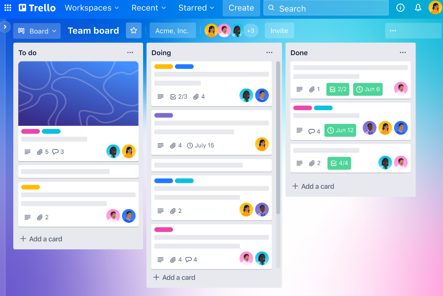
Within each “Board,” you can create “Lists” to represent the various stages of your workflow. Customize these lists to be as simple as “To Do,” “In Progress,” and “Done,” or tailor them to match your team’s specific needs.
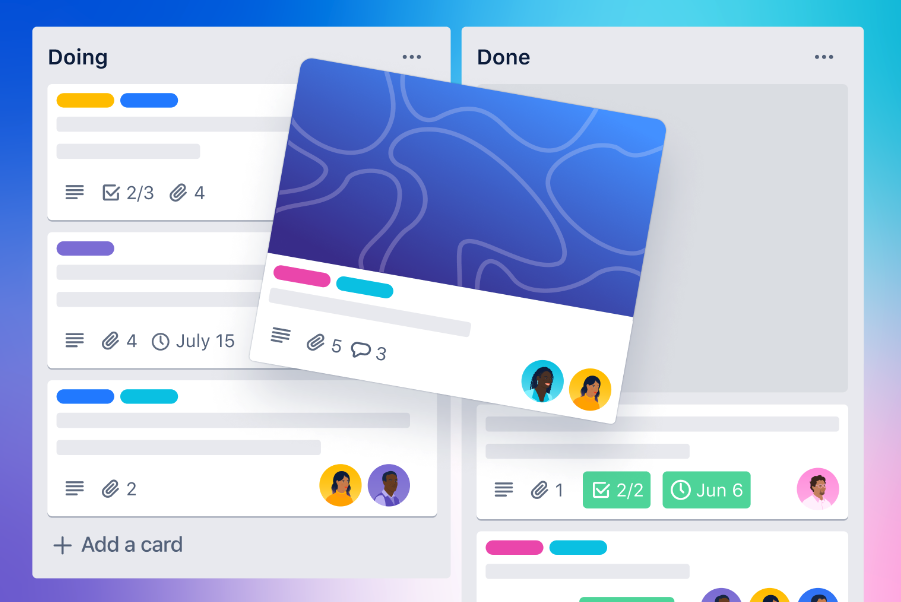
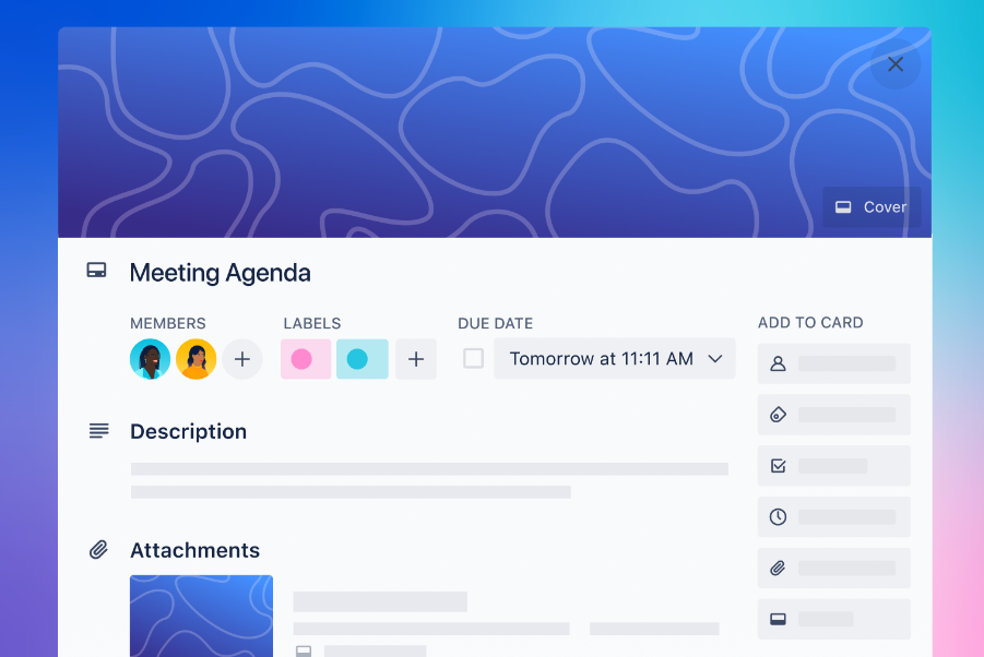
At the granular level, “Cards” represent individual tasks or ideas. Move each card across lists as work progresses to visually represent the task’s status.
“Cards” can also hold all the necessary information to complete the task, such as due dates, attachments, checklists, and comments from team members for detailed task management.
And how do you combine everything?
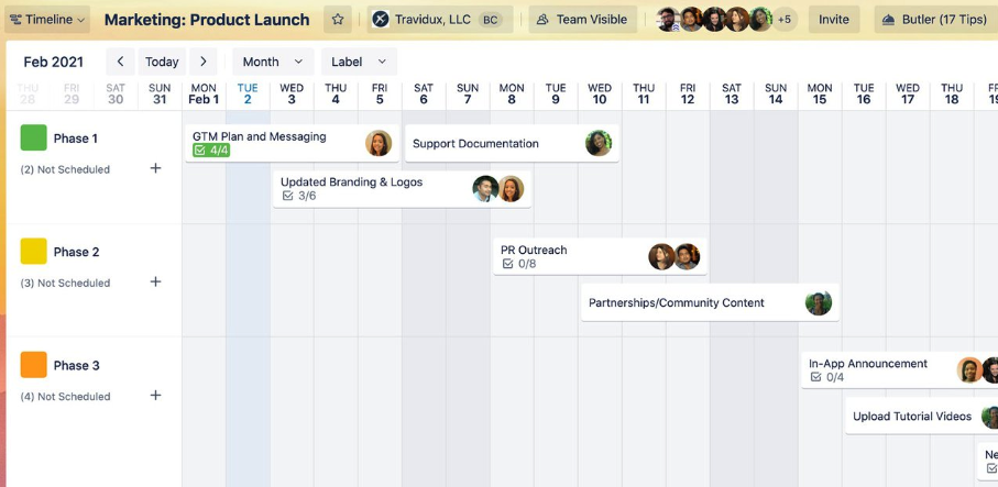
Trello’s “Timeline” view displays “Boards,” “Lists,” and “Cards” on a visual timeline. This adds a time dimension to see tasks organized over time.
You can access the “Timeline” view directly from your board. Open the “View Switcher,” enable the “Timeline” view, and then select “Timeline” from your board.
For example, you can use the “Timeline” view when planning a product launch. Add key phases and tasks on the timeline and assign team members. This lets you schedule out the launch plan and see who is responsible for each task.
What you’ll love
Trello’s “Power-Ups” connect Trello to other apps to ensure vital info is directly accessible within your project boards. The connectivity enhances “Cards” with additional details, from document integration to embedding feedback forms, without cluttering your workspace.
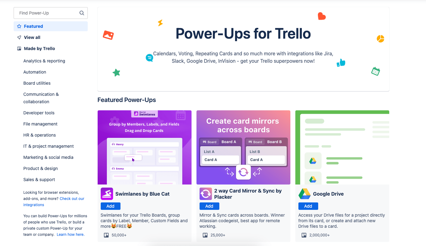
Here are a few examples of Trello Power-Ups and how they can enhance your boards:
- GitHub Power-Up attaches commits, issues, and pull requests to cards so you can track code changes without leaving Trello
- Google Drive Power-Up lets you attach Google Docs, Sheets, and Slides directly to cards for easy access to relevant files
- Zoom Power-Up embeds Zoom recordings onto cards to centralize meeting notes, decisions, and action items
- Typeform Power-Up lets you embed Typeform surveys onto cards to collect feedback from stakeholders easily
- Slack Power-Up brings Slack conversations into Trello so background context is accessible within your boards
- Calendar Power-Up connects your Google Calendar to overlay due dates, appointments, and availability onto cards
Core features of Trello you’ll like
- Custom fields to add metadata and track additional information on cards
- Automation rules to trigger actions like adding members, tracking dates, creating recurring tasks
- Multiple views like boards, timelines, tables, calendars to visualize work
- 200+ integrations with tools like Slack, Jira, and Google Drive to centralize work
- Time tracking and reporting Power-Ups to log time on cards and generate reports
- Templates to get started quickly with preset boards for project management and other workflows
Pricing
Trello has four plans:
- Free
- Standard: $5 per user per month
- Premium: $10 per user per month
- Enterprise: $17.50 per user per month (for 50 users)
6. Basecamp
Basecamp is a project management tool designed for small teams to collaborate and manage work. It provides tools to organize projects, track tasks, communicate, share files, schedule events, and get visibility into what everyone is working on in one centralized hub.
At a high level, Basecamp’s “Home” screen provides a centralized hub to view your top projects and priority cards across teams. You can pin your favorite pages and see your schedule and your assigned tasks.
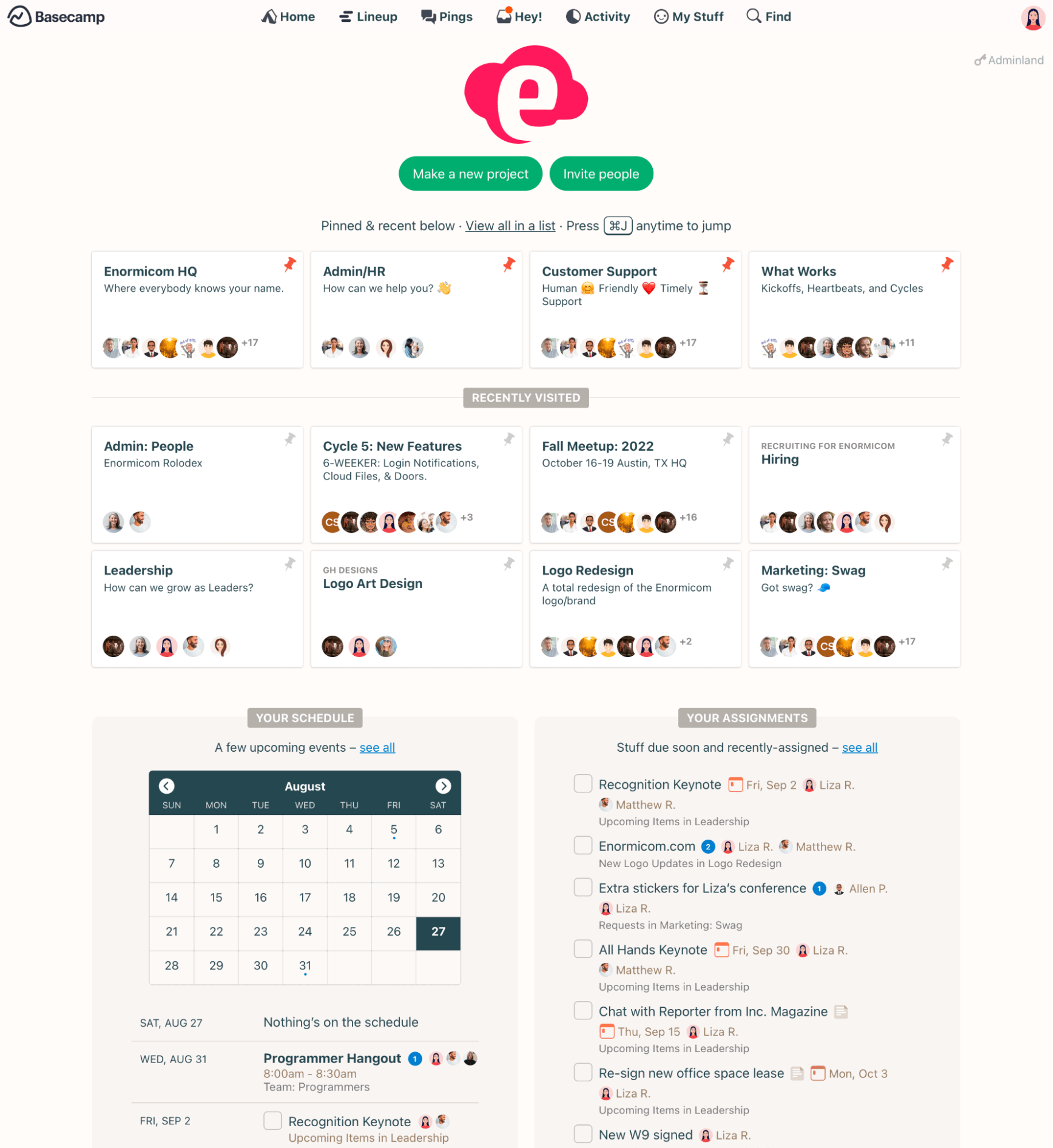
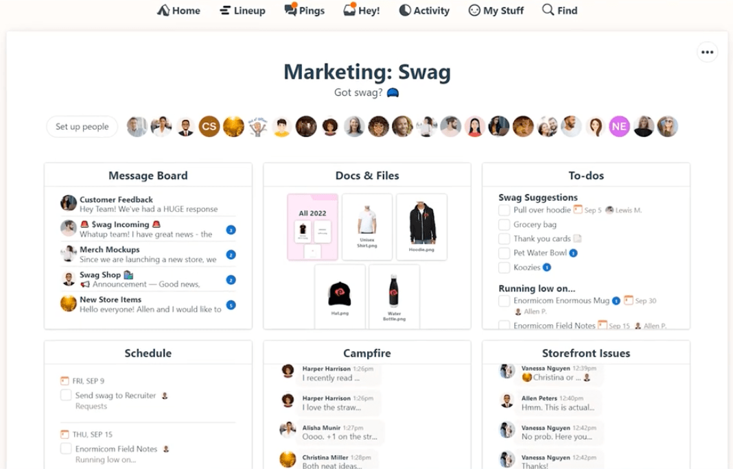
As you move to specifics, Basecamp’s project-level focus centralizes all critical components—message boards, to-do lists, files, schedules, and direct messaging—into clearly defined blocks to streamline navigation and project oversight.
For a more interactive and visual approach to managing specific types of work, you can use Basecamp’s “Card Table.” The “Card Table” tool streamlines tracking reactive work and ad hoc requests through a Kanban-style interface.
The “Card Table” works well for managing requests and issues directed at a specific team. It’s intended to track reactive work like resolving software bugs or handling design requests. But you can use it to organize any workflow that involves moving items through stages visually.
The “Card Table” starts with four columns: “Triage,” “Figuring it Out,” “In Progress,” and “Done.”
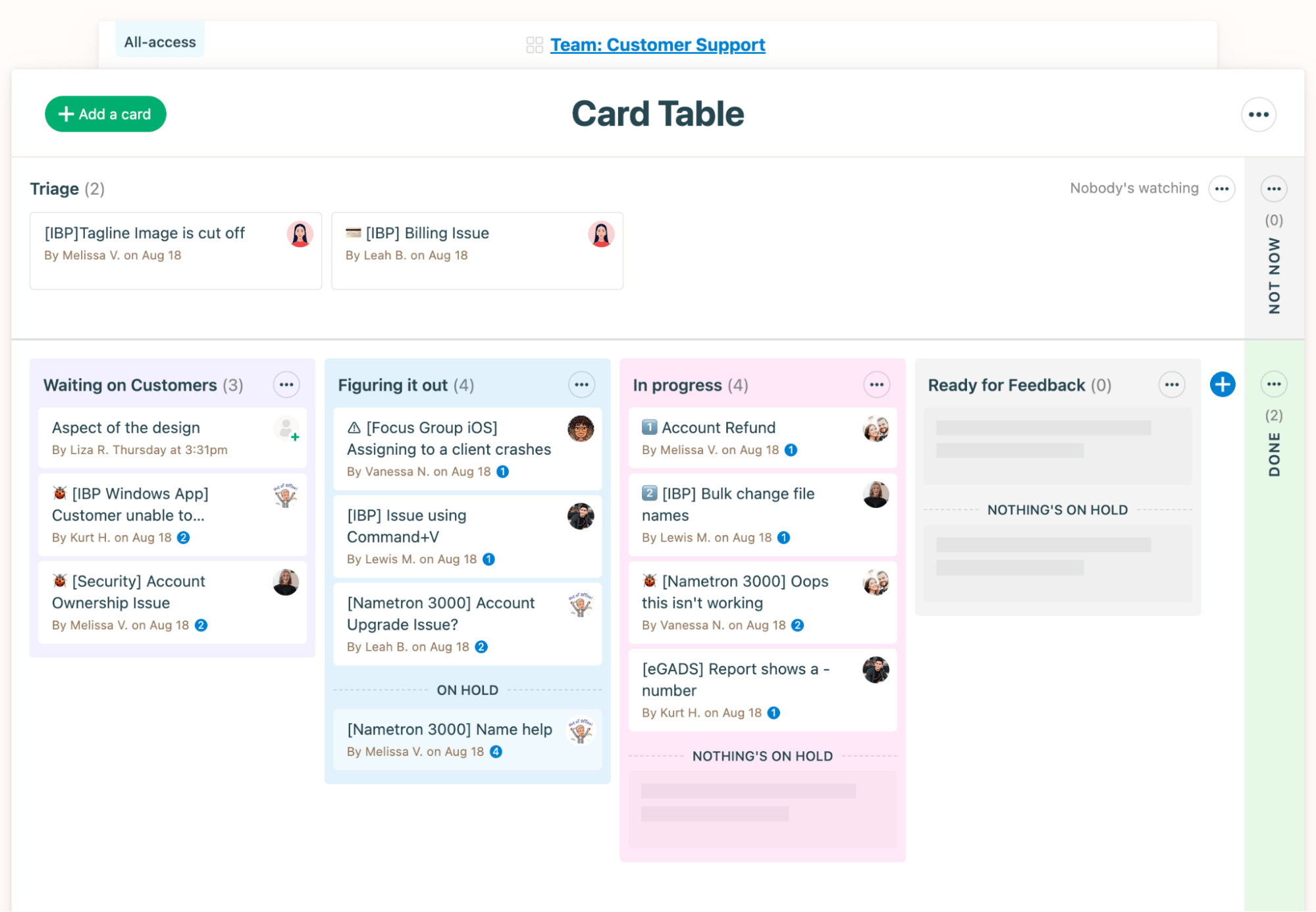
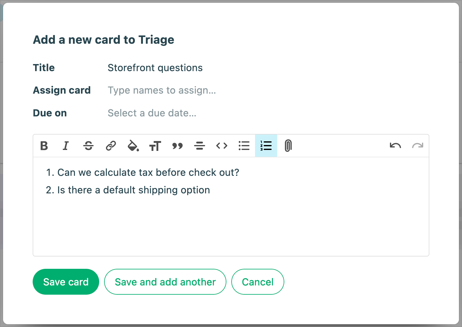
To add an item to track, click “+ Add a card,” which will place it in the “Triage” column by default. Give the card a title, assignee, due date, and description.
The card can then be dragged through columns like “In Progress” and “Done” to represent status changes.
Another way to view ongoing projects is the “Lineup” view. It’s a timeline view showing what your team recently completed, what’s active now, and what’s coming up next across all projects.
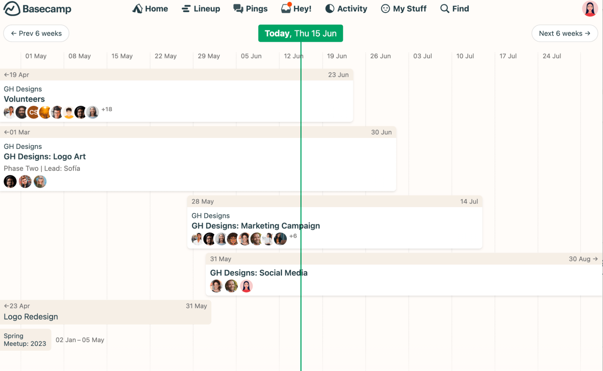
“Lineup” provides at-a-glance visibility into how long each project runs and where it falls on the calendar. The vertical green line marks today, no matter if you’re looking at a project or the “Lineup” page.
What you’ll love
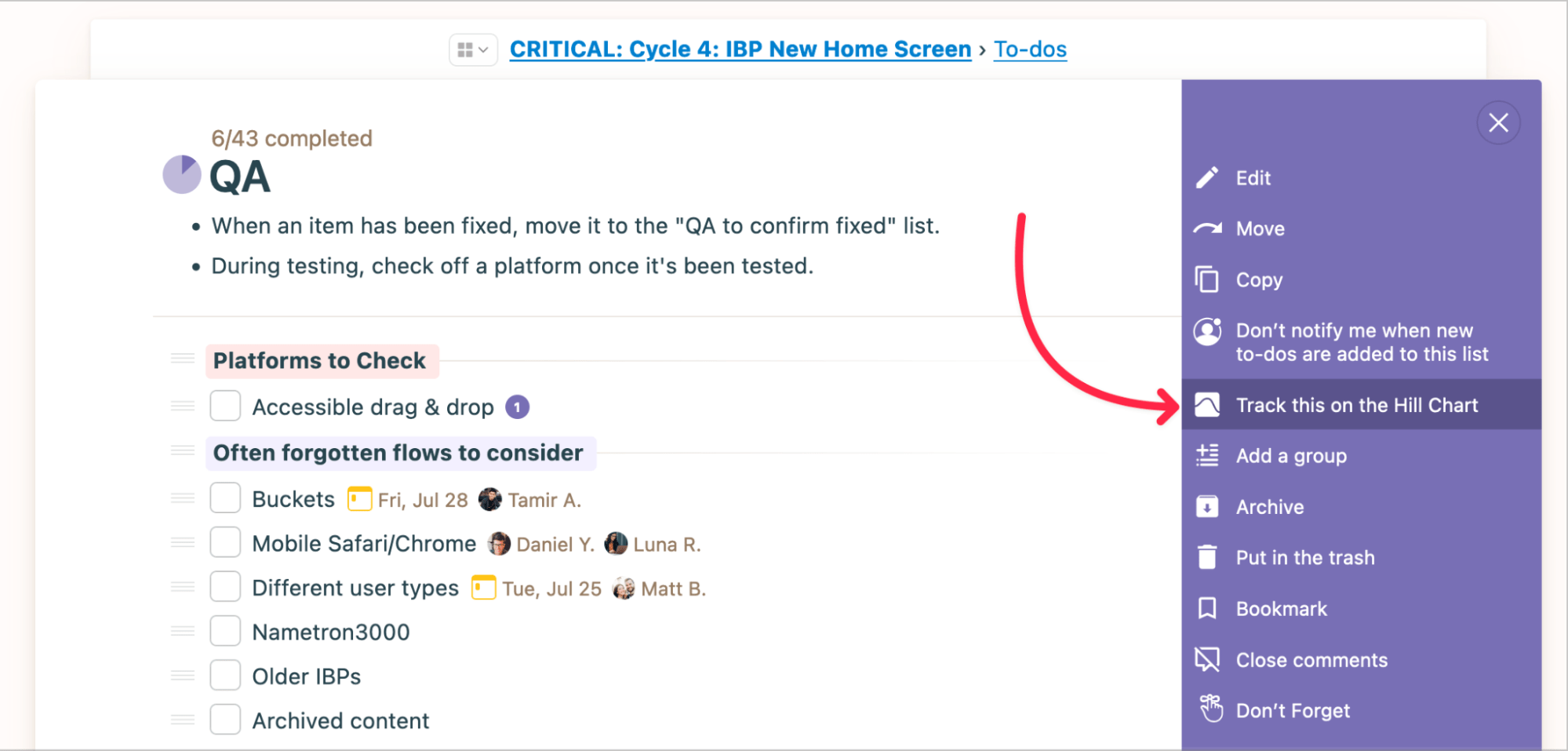
The “Hill Chart” provides a high-level visualization of project progress by representing work as “dots” plotted on a hill-shaped graph.
- The “uphill phase” – figuring things out
- The “downhill phase” – making solutions
Click the name of a to-do list and then choose “Track this on the Hill Chart” from the options menu.
Rather than just show tasks finished, drag chart dots to highlight obstacles or wins. Team leaders stay in the loop to help teams, not penalize them later for unexpected roadblocks.
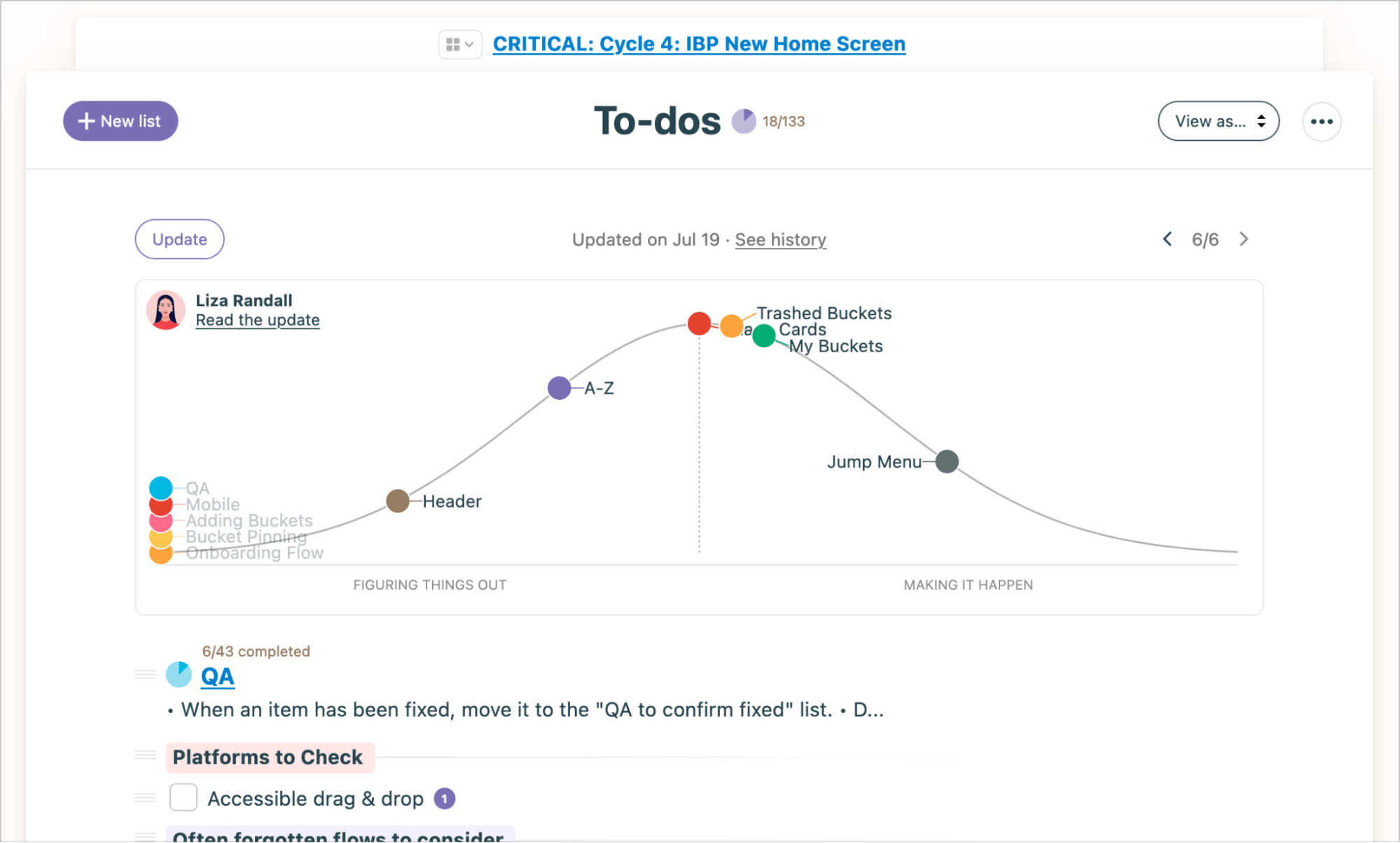
The vertical position of each dot indicates the status of that work:
- “Uphill” phase – still figuring things out, unknowns remain
- “Over the hill” – the plan is clear, only execution remains
- “Downhill” – actively working through execution
Drag dots to the appropriate place on the “Hill” to represent progress.
“Hill Charts” spotlight what’s blocking work, not just what’s done. A task list might show 90% finished while the hard stuff sits untouched. Charts surface this.
Look back through previous chart updates to guide decisions, not excuses like “It looked on track last week.” Hill Charts cultivate trust by shining light on the messy innards of getting stuff done.
Core features of Basecamp you’ll like
- Home dashboard to see all your projects, assignments, and schedules in one place
- Messages board for centralized discussions and communication
- To-Dos to create, assign, and track tasks
- Docs & Files to store, share, and discuss documents
- Real-time Chat for quick conversations within projects
- Schedule calendar to view dated tasks, milestones, and events
- Card Table as a kanban-style board to visually track work
- Automatic Check-Ins to regularly collect feedback from your team
- Hill Charts to provide visual high-level project progress at a glance
- Reporting to gain insights across multiple projects
7. Notion
Notion is a powerful, all-in-one workspace that offers various views and tools for project managers to track milestones and collaborate. Its value lies in its flexibility to cater to different team preferences and project needs.
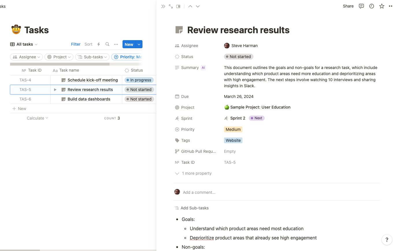
In Notion, you can organize projects using “Databases.”
Databases contain collections of pages with the same properties, like status, assignee, due date, etc. This allows you to view and track project details all in one place.
For example, you can create a database to manage tasks across different projects. Add properties like status, assignee, priority, sprint, and view it as a table. This provides an organized project task tracker with customizable columns.
You can then click a task to view and manage details like sub-tasks, comments, and other insights directly within the task page.
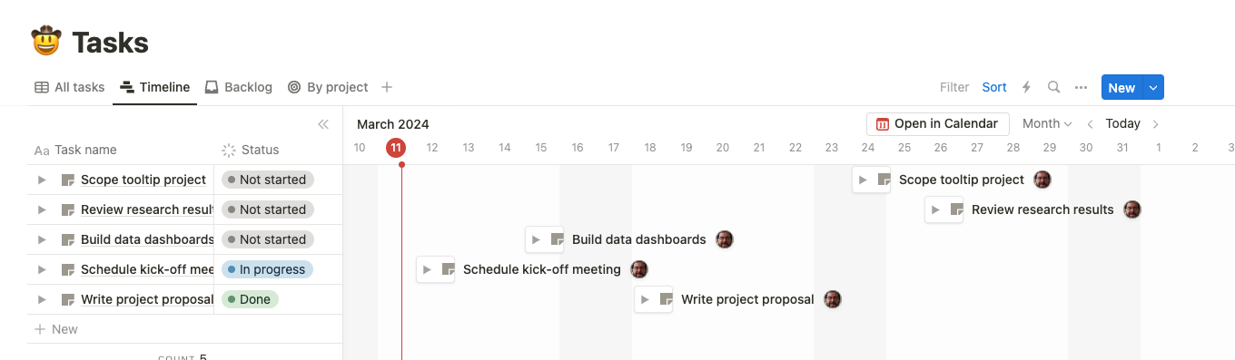
You can also visualize tasks on a timeline by creating a “Timeline” view for the project.
The “Timeline” offers a 360-degree view of how projects and tasks fit together, allowing teams to visualize dependencies and plan their work.
To add a timeline, click “+” and select “Timeline” from the dropdown menu.
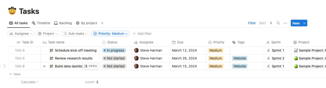
Notion also lets you customize views with powerful filters and sorts. For example, click “Add filter” then select “Priority” and “Medium” to only show medium priority tasks.
With the ability to tune each view’s focus based on everything and anything, Notion ensures laser-sharp visibility into the right information at the right time.
What you’ll love
Notion provides a massive library of project templates for various use cases, from roadmaps and calendars to issue tracking, planning, and ticketing.
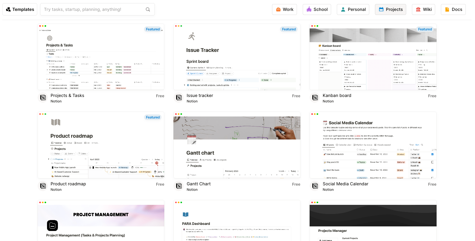
Some examples of popular project management templates in Notion include:
- Projects & tasks: A template to organize tasks, status, priorities, due dates, and more
- Issue tracker: For tracking bugs, feature requests, and other issues
- Kanban board: A visual board to map out project workflow
- Product roadmap: For planning product features and milestone releases
- Gantt chart: To visualize task schedules and timelines
- Content calendar: For scheduling and managing social media and blog posts
- Project management: An all-in-one template for task planning, tracking, and collaboration
Core features of Notion you’ll like
- Configurable views to see projects as tables, boards, timelines, calendars, etc.
- Databases to track tasks, deadlines, progress bars, dependencies, and assignees
- AI writing assistance to generate drafts and improve project docs
- Automations for workflows like adding user stories and status updates
- Sprint templates for agile processes to groom backlogs and track bugs
- Integrations with tools like Figma, Slack, GitHub, and Jira
- Linked tasks so details are accessible directly within project plans
- Team collaboration features for task assignments, dependencies, and communications
- Wikis and docs to centralize knowledge and information
Pricing
Notion has four plans:
- Free
- Plus: $8 per user per month
- Business: $15 per user per month
- Enterprise: customized enterprise pricing
8. Airtable
Airtable is a cloud-based database and spreadsheet software that enables users to create customizable data tables that connect and display in an interface similar to spreadsheets.
The real value is Airtable’s ability to customize and build apps directly within the platform. Choose from over 80 apps or even create your own to tailor workflows and data analysis.
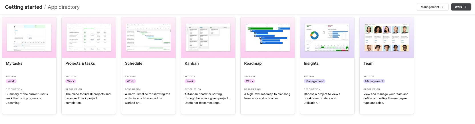
For example, Airtable has a “Project Management” database filled with useful apps to help you better manage your projects.
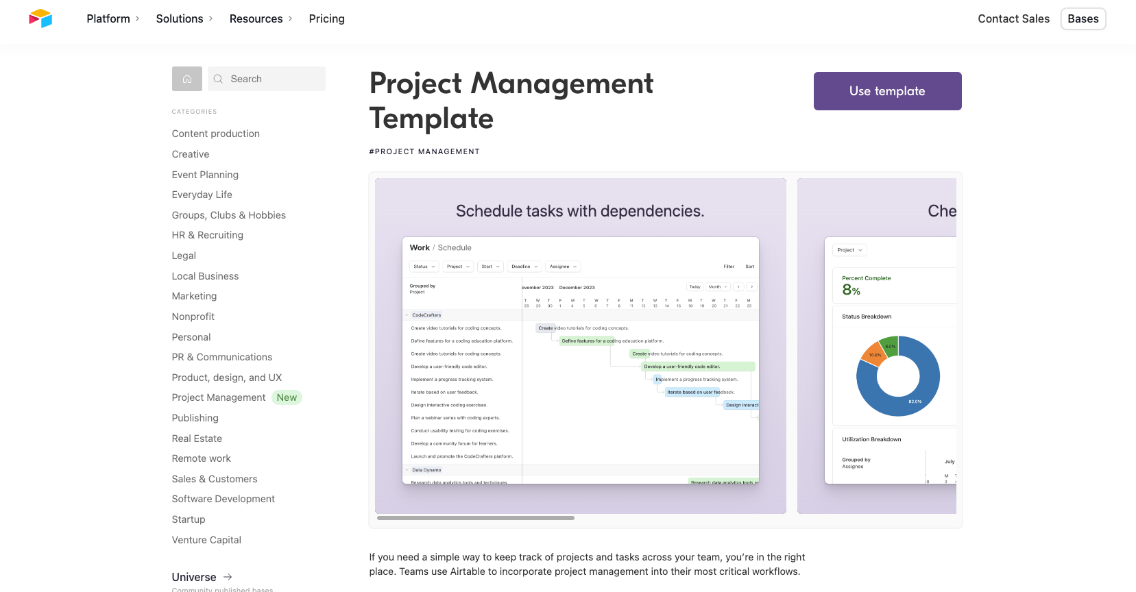
Once you install the database, you’ll get access to the following apps within it:
- My tasks: Customizable board to track personal to-do items, deadlines, and progress
- Projects & tasks: Central hub to coordinate project details, assign tasks, set dependencies, and track status. Integrates with Scheduling and Timelines
- Schedule: Gantt chart timeline view to visualize task schedules and identify dependencies. Ensures on-time delivery
- Kanban: Flexible board to organize tasks and work-in-progress by status. Streamlines team coordination
- Roadmap: High-level planning template to map out objectives, milestones, and launches
- Insights: At-a-glance visualization of project statistics like completion rates, traffic light status, and task allocation
- Team: Overview of team members, roles, and responsibilities across projects. Enables efficient delegation
The “Roadmap” app offers a visualized schedule overview of projects, displaying colored bars stretching from start dates to end dates. To track progress easily, you can see completion percentages for each item (e.g. 100%, 50%, etc.)—bars will even show as green when fully complete.
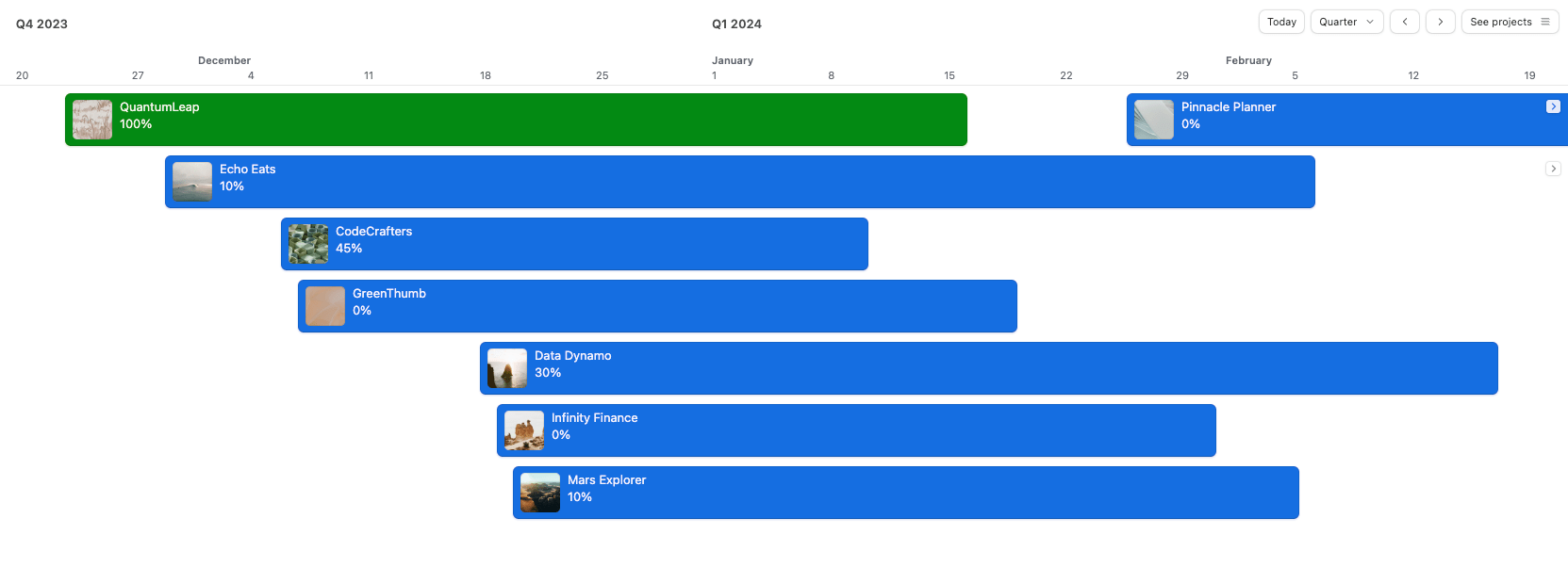
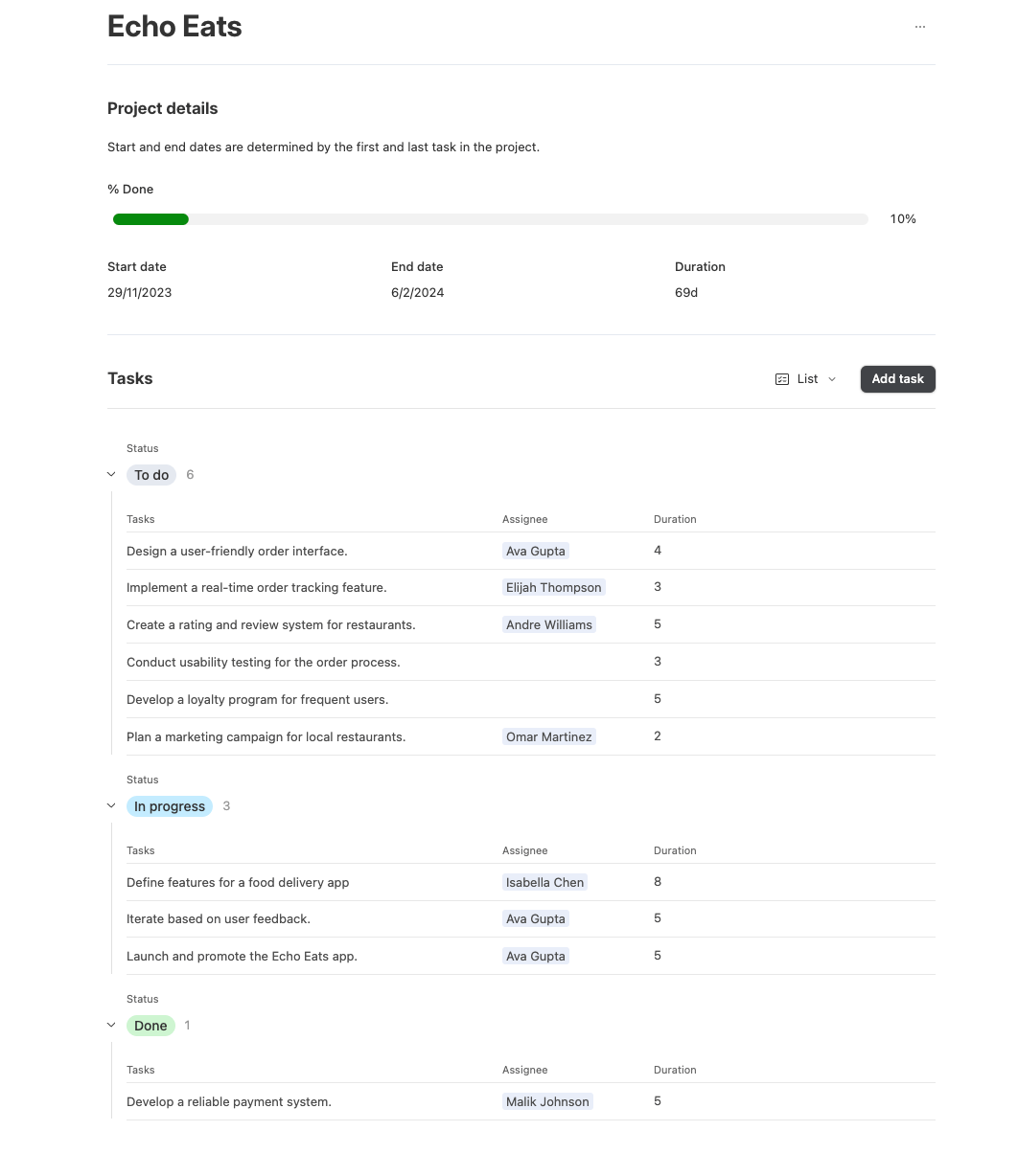
Click on one of the bars projects in the “Roadmap” to view project details like duration, to-do, in-progress, and completed tasks. Here, leave comments providing extra context, changes in scope, or feedback to those assigned to specific tasks within the project.
Airtable’s “Insights” dashboard within “Management” integrates analytical data visualizations for broader oversight to supplement this.
- The “Status Breakdown” pie chart breaks down all tasks across to-do, in progress, and done – giving a simple graphical representation of overall progress.
- The “Number of Tasks per Assignee” chart shows the volume of work assigned to each team member. This helps identify over or under-utilized resources.
- The “Utilization Breakdown” shows the number of hours each person works and where they spend their time.
At a higher level, indicator metrics quantify the percentage completed and overdue for all tasks. You can filter any report by assignee, project, or date range.
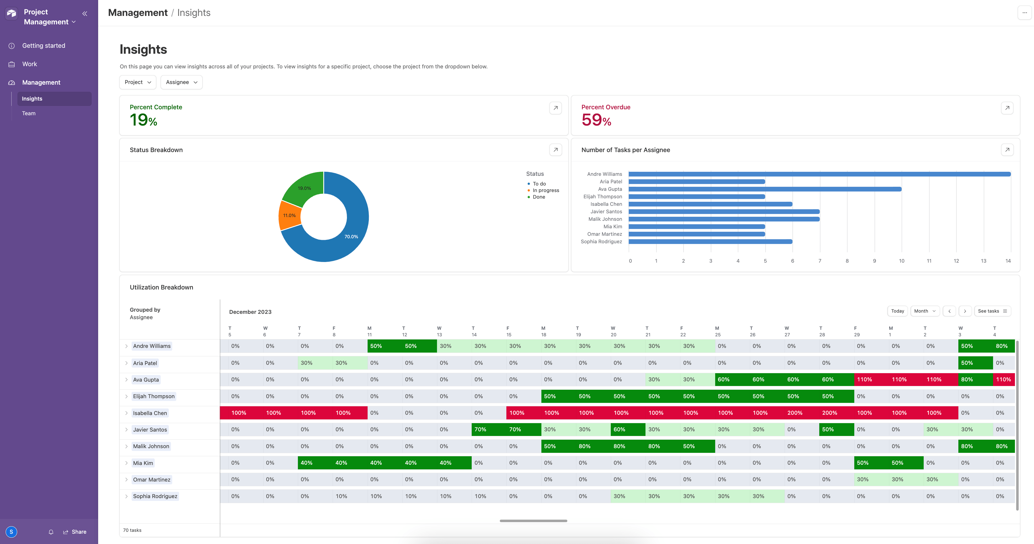
The “Status Breakdown” pie chart breaks down all tasks across to-do, in progress, and done – giving a simple graphical representation of overall progress.
What you’ll love
Anyone can create and share custom interfaces without coding with “Interface Designer.”
Design tailored interfaces that present project data in the most intuitive and actionable format for your teams—creating dashboards highlighting key project milestones, designing forms for seamless data entry, or setting up personalized views focusing on specific project aspects.
To create an interface, select the “Interfaces” button at the top of an existing base and “Create a new” to start building your new interface.
You can make a Kanban Board to track tasks and progress on a project visually. This allows you to map and categorize work into columns like “To-Do”, “In Progress,” and “Completed” for an at-a-glance status view.
Using the “Timeline” interface is great for mapping out the different phases and milestones of a project on a visual timeline. You can see how tasks fit together and ensure you hit key deadlines.
With a “Dashboard” interface, you can get a birds-eye look at overall project health. Add charts for task progress metrics and key data visualizations to monitor things like utilization, workload, and budget.
Core features of Airtable you’ll like
- Flexible databases to track projects, tasks, issues, resources, etc.
- Kanban boards to visualize workflows and task status
- Calendar views to schedule milestones and timelines
- Interactive interfaces to create custom views of data
- Reporting dashboards to analyze progress, utilization, and metrics
- Automatic notifications on task changes or overdue items
- Project templates with preset frameworks to get started quickly
- Collaboration tools like task assignments, comments, and activity logs
Pricing
Airtable has three plans:
- Free
- Team: $20 per user per month (billed annually)
- Business: $45 per user per month (billed annually)
- Enterprise Scale: customized enterprise pricing
9. Jira
The project management tool Jira, developed by Atlassian, is rooted in software development and agile project management. Jira lets you easily plan, track, and release software development projects.
For example, build workflows during the project planning phases with statuses like “To Do,” “In Progress,” and “Done” that match your team’s planning methodologies.
Once the project is up and running, get a snapshot of your team’s progress through the “Timeline” view.
It’s a Gantt chart view to visualize and plan the timing and sequence of individual issues. Schedule bars indicate when each issue in your project will start and end.
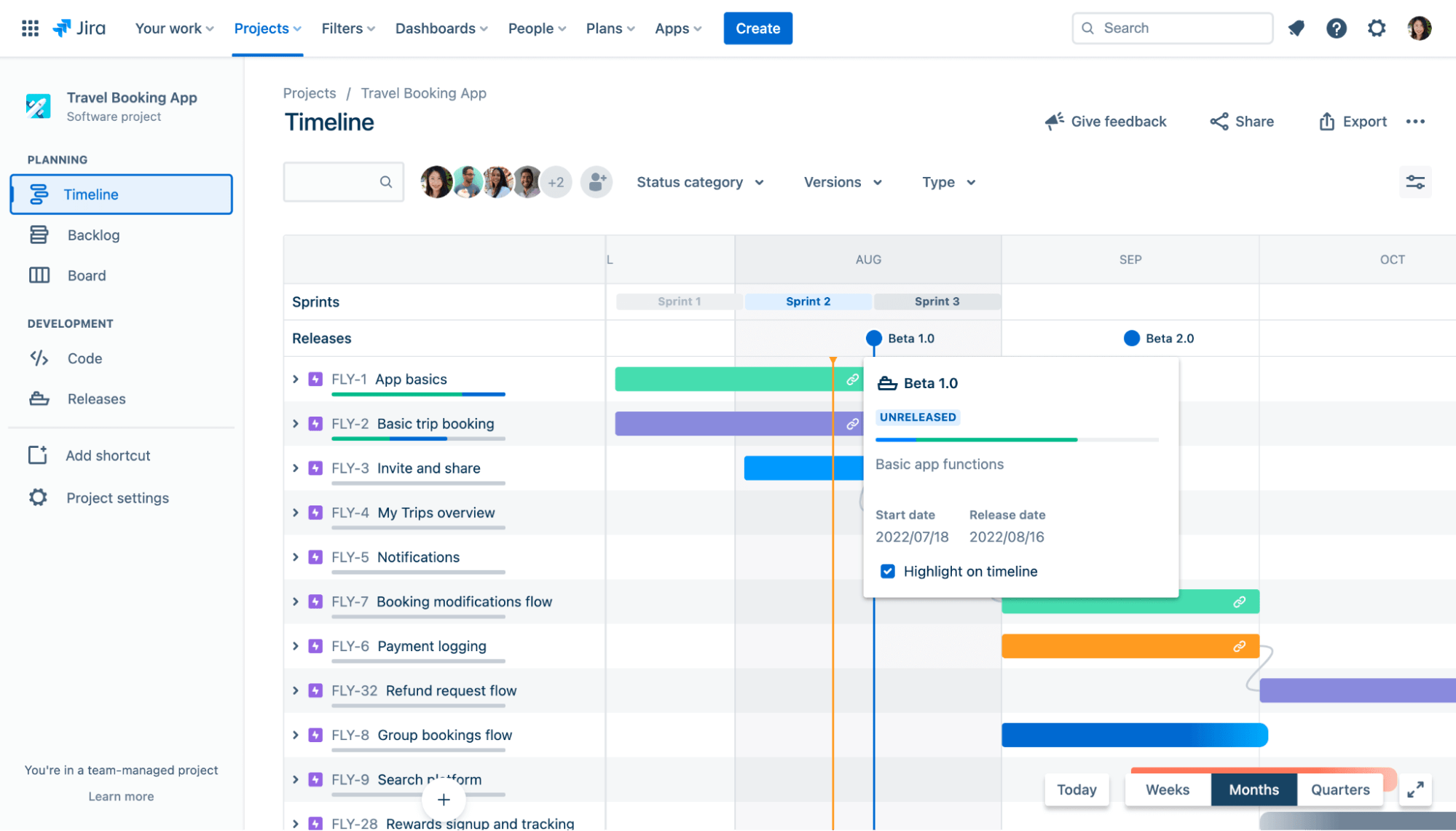
Use the view to:
- Adjust an issue’s start and due date or change the duration by dragging the handles of each bar
- Reschedule an issue by dragging the schedule bar
- Link issues in the timeline contingent on others being completed first.
- View which issues may be blocked due to a certain issue
- Change how much time you’re viewing with the button in the bottom right: Weeks, Months, or Quarters
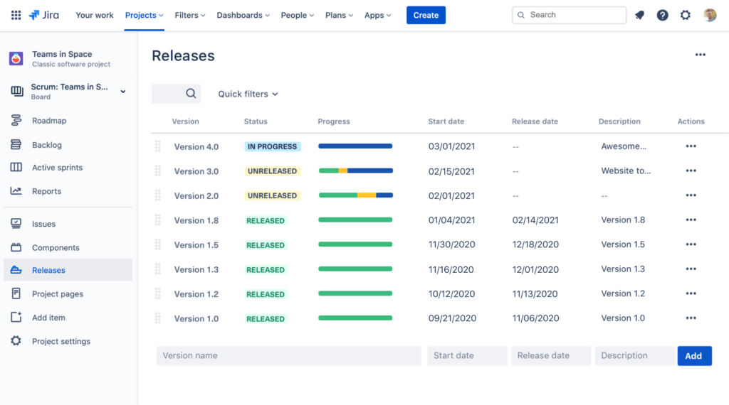
Then, use the “Releases” tab to check which projects your team has released or is close to releasing. To show releases on your timeline, click “View” settings on the top right corner of your timeline and check the box next to “Releases.”
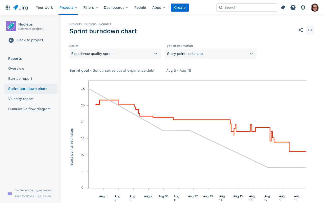
Lastly, Jira’s advanced reporting gives you a holistic view of how your team is performing.
For example, for scrum teams, Jira offers sprint reports, burndown charts, release burndowns, and velocity charts to improve planning and retrospectives.
For Kanban teams, cumulative flow diagrams and control charts provide insights into workflow optimization. And issue analysis and forecasting reports help with capacity planning, workload management, and identifying trends.
What you’ll love
Jira features a powerful search functionality using “Jira Query Language.” The three flavors of search in Jira software — quick, basic, and advanced — can help you find important information about your projects.
For example, use JQL to find all high-priority bugs in a project the system hasn’t yet assigned and reported in the last two weeks. Targeted action lets you deal with critical issues quickly.
Core features of Jira you’ll like
- Scrum and Kanban boards to visualize and track work in sprints or continuous flows
- Backlogs to organize issues and plan sprints
- Roadmaps to map out initiatives on visual timelines and see dependencies
- Reports like burndown charts, velocity, and control charts to monitor progress
- Agile workflows that are customizable for any team’s processes
- Versions for planning and tracking software releases
- Issue types to categorize different types of work like bugs, stories, tasks
- Search and filters to find relevant issues and build dashboards quickly
- Integrations with 1,000+ other apps, including GitHub, Jenkins, Slack
- Automation to simplify repetitive tasks like subtasks, transitions, assignments
- Custom fields to capture additional metadata like priorities, components, environments
- Permissions to control access and edit rights across projects
Pricing
Jira has four plans:
- Free: for 10 users or less
- Standard: $850 per year (user tier 1 to 10)
- Premium: $1,600 per year (user tier 1 to 10)
- Enterprise: customized enterprise pricing
10. Adobe Workfront
Adobe Workfront is an enterprise work management platform built for creative teams.
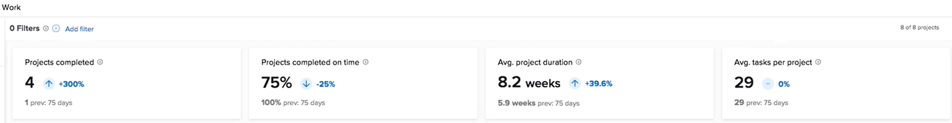
At a high level, “Work Charts” surfaces key statistics through its dashboard to help spot bottlenecks across portfolio health, on-time delivery, duration, and workload. To access the analytics dashboard, click the “Main Menu” icon and select “Analytics.”
Here’s what it looks like:
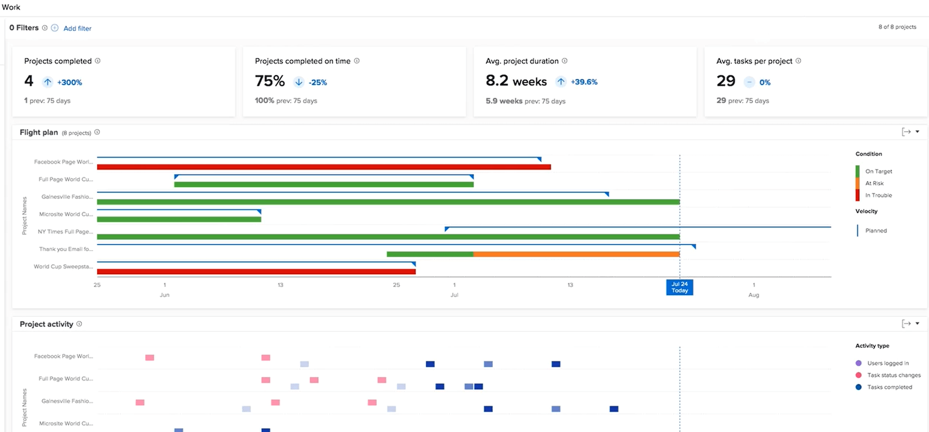
KPIs like projects completed, projects completed on time, average project durations, and average tasks per project help you spot bottlenecks across portfolio health, on-time delivery, duration, and workload.
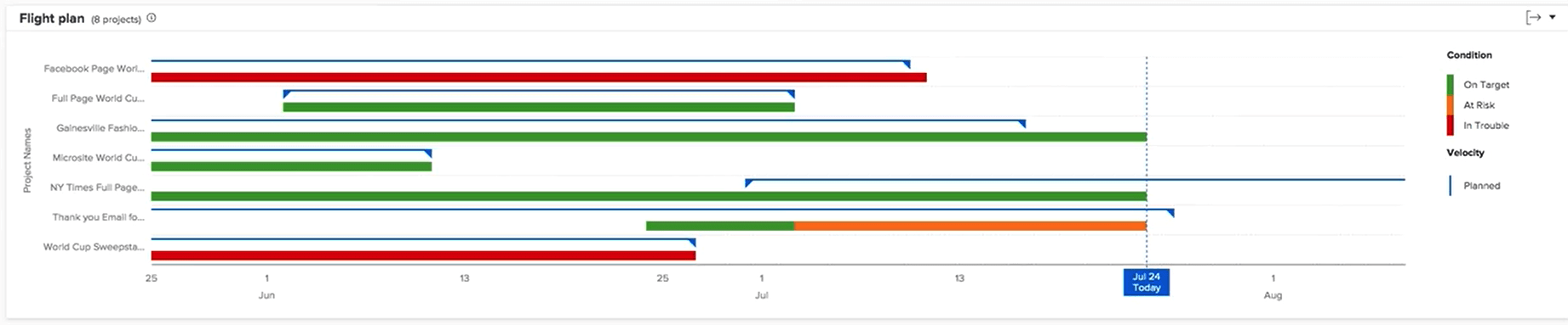
Teams can also visualize project timelines and completion risk through Workfront’s “Flight Plan” chart. This timeline view plots out planned vs actual start and end dates to reveal delays plus projects that are on target (green), at-risk (orange), or in trouble (red).
To view the “Flight Plan” chart, filter to relevant projects, scroll to the “Flight Plan” chart and hover over lines to see dates.
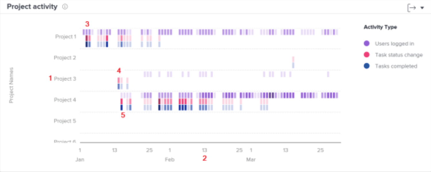
As you move below, the “Project” activity chart allows you to understand and compare project activities—users logged in, task status changes, and tasks completed—against other projects in Workfront. Project activities are displayed in different colors to summarize the activities over a period of time.
Seeing this information helps you determine:
- The activity on a specific project.
- The activity of one project compared to other projects.
- Which users are working on a project, and at what frequency
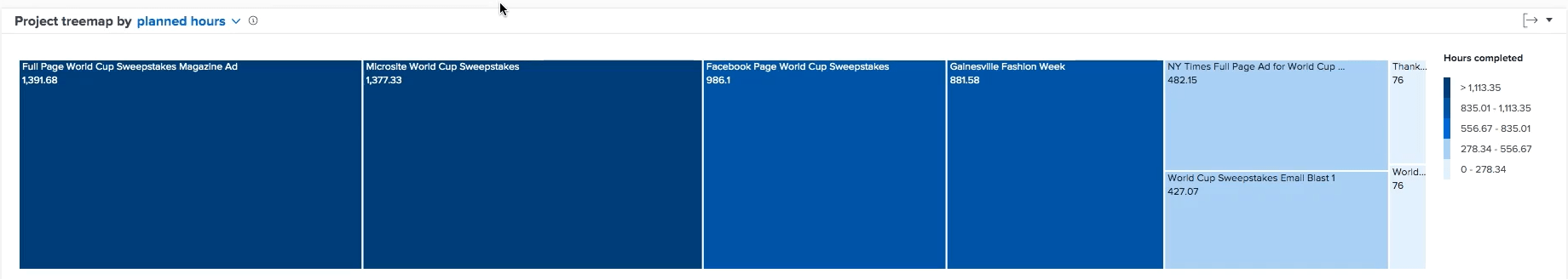
Lastly, at a more granular level, Workfront offers a “Tree Map” chart for understanding time breakdowns across specific initiatives. The boxes represent projects, with size proportional to the effort spent.
What you’ll love
The “Portfolio Optimizer” helps you to prioritize projects based on net value, alignment, cost, risk, and ROI.
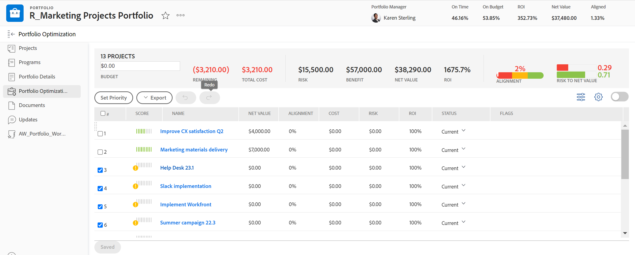
You can evaluate projects against these dimensions:
- Net Value: Look at the total net value (planned benefits minus costs) calculated for each project and the entire portfolio. This allows you to prioritize projects that deliver the highest net value to your organization.
- Alignment: Review the alignment score given to each project based on how well it supports your company’s strategic objectives. This score is determined using the scorecard in the project’s business case. Pay attention to the average portfolio alignment score shown as well. Prioritize projects that are highly aligned with your strategy.
- Cost: Examine the total cost, budget, and remaining budget provided for your portfolio. Drill down to see each project’s individual costs, too. This cost data enables you to prioritize lower-cost projects when needed to manage budget constraints.
- Risk: Assess the total potential risk cost of your portfolio and the risk costs of individual projects. Use the Risk to Net Value indicator to weigh potential risks against the expected net value. Focus on prioritizing lower-risk projects to minimize uncertainty.
- ROI: Analyze the portfolio ROI calculated from the total planned benefits and budgeted costs of your projects. Maximize value by prioritizing the projects with the highest ROI.
By digging into these dimensions using the data surfaced in the “Portfolio Optimizer”, you’ll have the data to make better financial decisions for your business.
Core features of Adone Workfront you’ll like
- Work automation to connect systems, sync data, and automate workflows across applications
- Budget & expense management for real-time visibility into budgeted, forecasted, and actual spend
- Workflow management to streamline end-to-end processes from strategy to delivery
- Proofing & approvals for collaborative document reviews and approvals in a single tool
- Reporting & dashboards for real-time insights and automated reporting to stakeholders
- Enterprise security with industry-recognized standards to protect critical business data
- Integrations with Adobe Creative Cloud, Experience Cloud, Anaplan, and other key apps
- Resource management to optimize team capacity and balance workloads across projects
- Templates to standardize best practices and eliminate manual processes
Pricing
Workfront has three plans with custom pricing:
- Select
- Prime
- Ultimate
Detailed pricing is available upon request
11. Smartsheet
Smartsheet’s spreadsheet-like interface combines the familiarity of traditional spreadsheets with powerful project management features.
The sheet is the foundation of your work—view a sheet as a “Grid,” “Gantt chart,” “Calendar,” or “Card.” Use the Views buttons in the top toolbar to switch between these views.
For example, the interactive Gantt chart outlines all tasks, owners, start/end dates, and dependencies within a project. You can easily drag and drop to re-order tasks or adjust timelines. The Gantt auto-adjusts around dependencies to plan projects, establish critical paths, and confidently meet deadlines. 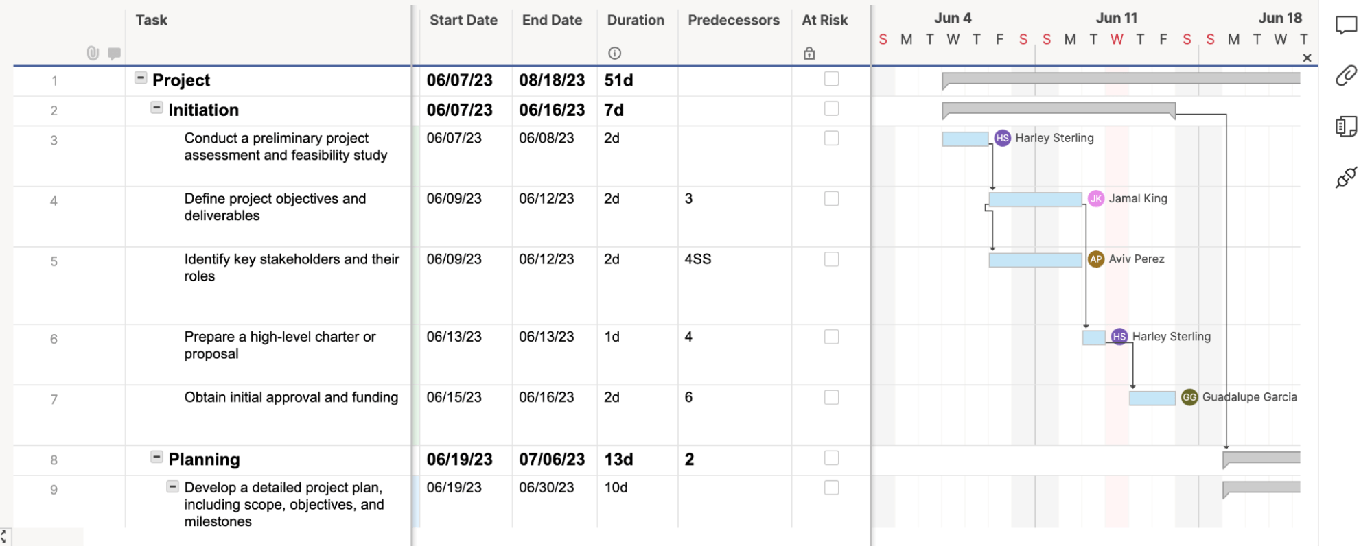
The Gantt chart is handy when assigning resources to tasks and seeing how proposed schedule changes may impact team members. The resource utilization functionality shows over- and under-allocation at a glance.
All project info rolls up into Smartsheet’s customizable dashboards that display high-level metrics.
For example, the “Project & Resource Overview” dashboard shows key data like budget vs actual hours, completion status, and resource allocation across projects.
The dashboard allows you to compare planned timelines and budgets against actuals to pinpoint areas for intervention or adjustment.
You can also add other widgets to showcase sheets, reports, charts, forms, and content from other places like Google Docs, Tableau, Power BI, and YouTube.
The interactive views and dashboard roll-ups give managers clear visibility into resource utilization, project status, and progress toward goals.
What you’ll love
Cross-sheet formulas in Smartsheet allow you to track, analyze, and report on data across multiple sheets.
Use functions like VLOOKUP, SUMIF, and COUNTIF to consolidate critical project metrics from various sources into a central dashboard and enable real-time visibility into project status, resource allocation, and performance metrics.
Here are some examples of useful cross-sheet formulas:
- Calculating sales pipeline values from multiple regional sales sheets
- Tracking percent completion across multiple projects for an executive portfolio dashboard
- Consolidating project health statuses into a single dashboard
- Summing hours worked across multiple projects to see the total work
- Calculating resource utilization rates and overallocation risks
Core features of Smartsheet you’ll like
- Resource management to allocate resources effectively across projects with heatmaps and project/cross-project views
- Budget management to create and track project budgets by time, currency or expense and monitor cost thresholds
- Analytics & Reporting with real-time dashboards, consolidated data, and shareable reports for the right insights at the right time
- Workflow Automation to quickly implement powerful automated workflows that eliminate repetitive manual tasks
- Integrations with popular apps like Slack, Google Workspace, Jira, and Microsoft Teams to bring all information into Smartsheet
- Templates for common project types like agile projects with Gantt, project management office, budgets, tracking, and more
Pricing
Smartsheet has three plans with custom pricing:
- Free
- Pro: $7 per user per month
- Business: $25 per user per month
- Enterprise: customized enterprise pricing
Simplify project management with Scoro
Each of these tools simplifies project management in a unique way, and Scoro is no exception. It’s the best project management tool for agencies and consultancies that need an all-in-one solution to manage their projects, teams, and tasks.
A 360-degree view of all your projects—that’s Scoro. Sign up for a free trial and discover how Scoro can streamline your project management processes.