
Let’s address the elephant in the browser tab:
You are reading a guide to “Best Capacity Planning Tools”… on the Scoro blog.
Spoiler alert: Scoro is on the list.
Does that make us biased? Absolutely.
But we aren’t stupid.
We know you didn’t come here to read a fluff piece where we list ourselves at #1 and fill the rest of the slots with digital egg-timers just to make us look good.
We’ve listed the tools prospects actually compare us to in the wild. The ones that are actually worth your budget.
So, whether you want a standalone scheduler or the full Scoro experience (had to say it), let’s dive in.
Is this article for you?
If you are currently managing your team’s capacity in a spreadsheet that crashes every time you open it—yes, this is for you.
We wrote this for agencies, consultancies, and tech firms that have outgrown manual planning and need a “single source of truth” (that isn’t a color-coded Excel file from 2019).
| Tool | Best for | G2 Rating | Starting price |
|---|---|---|---|
| Scoro | Any professional service businesses that want to manage team capacity, projects, and finances in one integrated platform | 4.5/5 | $26/user/month |
| Resource Guru | Traffic managers and project leads who just want a digital whiteboard to stop double-booking people, but don’t want the complexity of a full PSA platform | 4.7/5 | $4.16/user/month |
| Parallax | Digital agencies and software shops that are tired of poor “Sales vs. Delivery” handoffs | 4.7/5 | Custom pricing |
| Teamhood | Teams managing multiple projects who need full visibility into workload and capacity | 4.7/5 | Free for up to 10 users |
| Runn | Professional service companies that need real-time capacity management with advanced analytics | 4.5/5 | $10/user/month |
| Forecast | Professional services organizations seeking AI-powered scenario planning | 4.2/5 | Custom (min. 15 users) |
| Toggl Focus | Creative agencies, consultancies, and small teams who need to know where their time is going and schedule people without burning them out. | 4.3/5 | Free for up to 5 users |
| Float | Teams wanting “people-first” planning that connects visual scheduling with financial profitability. | 4.3/5 | $7/user/month |
| Mosaic | Creative agencies, marketing teams, and tech companies that want an AI-driven platform | 4.7/5 | ~$9.99/user/month |
| Supervisible | Agencies and professional services firms seeking visual capacity planning with built-in profitability tracking | N/A | Contact for pricing |
1. Scoro
Founded in: 2013
Average customer ratings: G2: 4.5/5 (457 reviews); Capterra: 4.5/5 (260 reviews)
Best for: Professional service businesses that want to manage team capacity, projects, and finances in one integrated platform
Overview
Most tools force you to choose between detailed project management and high-level resource planning. Scoro is a Professional Services Automation (PSA) platform built for large teams that connects both.
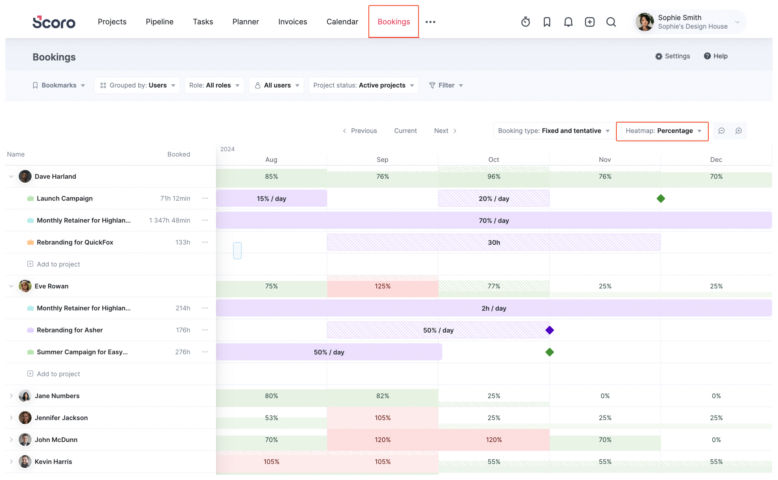
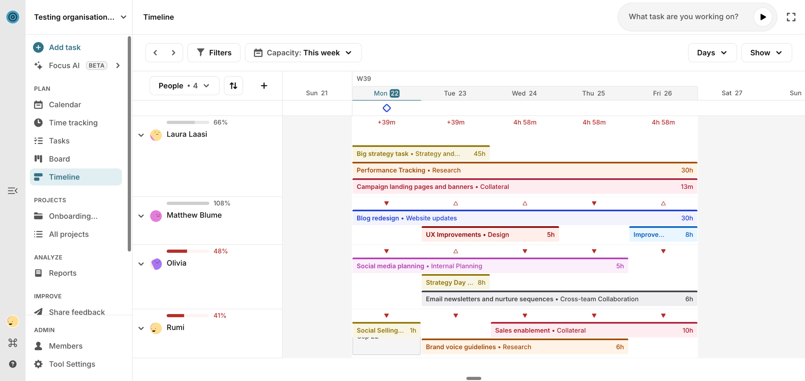
That’s why the core of our capacity engine is the Bookings Module.
Bookings allows you to reserve high-level chunks of time without getting bogged down in the granular details of specific tasks. Think of it as the difference between “I need a designer for 20 hours next week” (Booking) vs. “I need a designer to change this font size” (Task).
The module provides a Portfolio-Level Heatmap that visualizes your reality in one view: showing you confirmed bookings (when people are definitely working) alongside tentative bookings (pipeline work).
This lets you spot availability gaps and forecast capacity needs before a contract is even signed.
Capacity planning features you’ll like
- Utilization heatmaps: Visual, color-coded grids that show availability across the next week, month, or 6 months. Highlight burnout risks and bench time instantly.
- Role-Based Planning: Don’t know who is doing the work yet? Just book a “Placeholder Role” (e.g., Developer) to reserve the capacity, then assign the specific user later.
- Tentative vs. Fixed: Distinguish between “committed work” (Solid) and “pipeline dreams” (Striped) so you don’t accidentally overhire based on uncertain deals.
- Drag-and-Drop Reallocation: If a project slides or a team member gets sick, just drag their booking to a different week or transfer it to a different user in two clicks.
- Workload planner: Schedule specific projects and tasks within a calendar-like view to identify granular work conflicts in real time
- Multiple ways of tracking time: Track billable and non-billable time in three different ways, giving you accurate, live data for capacity planning
- Detailed reporting: Access over 50 reports or build custom dashboards to support smarter planning, from identifying resource gaps to accurately forecasting your revenue for the next 12 months
Integrations
Scoro integrates with over 45 tools, including:
- Slack
- Asana
- Jira
- Basecamp
- Google Docs, Calendar, Email
- QuickBooks
- Stripe
- HubSpot
- Salesforce
- BambooHR
You can connect with most other tools through Zapier and SyncHub. Or create your own integrations with Scoro’s API.
What others say about Scoro
“One tool for everything I need to control in the projects I manage. No more spreadsheets that do not connect. Results and PPL allocation and capacity in real time!”
—Paula, G2
“We have also been able to fully utilize all of our consultants’ time. By being able to schedule and assign tasks well into the future, we have been able to make sure everyone within our organization is being used at capacity (tracked in the Planner and through Utilization Reports).”
—Barb, G2
Pros & cons
| Pros | Cons |
|---|---|
| All-in-one platform connecting capacity planning with projects and financial insights | Higher price point than stand-alone capacity planning tools |
| Real-time utilization tracking with clear visual indicators and percentages | Might be overkill for teams that just want a basic capacity planning tool |
| Flexible booking system that handles both tentative and confirmed work | |
| Visual planner with drag-and-drop scheduling and instant utilization updates | |
| Extensive integration options (45+ tools) |
Pricing
Scoro offers four pricing plans:
- Core: $19.90 per user per month
- Growth: $32.90 per user per month
- Performance: $49.90 per user per month
- Enterprise: Contact sales for pricing
To try Scoro out for yourself, sign up for a two-week free trial.
One more thing…
We think it’s worth remembering that there are real people behind this platform. Scoro started in Estonia in 2013 and has since grown into a global team spread across Europe and North America.
We spend our days talking to agencies and consultancies to figure out exactly what drives them crazy—then we build features to fix it.
That photo?
That’s us at our 2025 Global Week. We bring the entire company together twice a year to bond, brainstorm, and apparently, take over movie theaters.

2. Resource Guru
Founded in: 2012
Average customer ratings: G2: 4.7/5 (365 reviews); Capterra: 4.7/5 (526 reviews)
Best for: Traffic managers and project leads who just want a digital whiteboard to stop double-booking people, but don’t want the complexity of a full PSA platform.
Overview
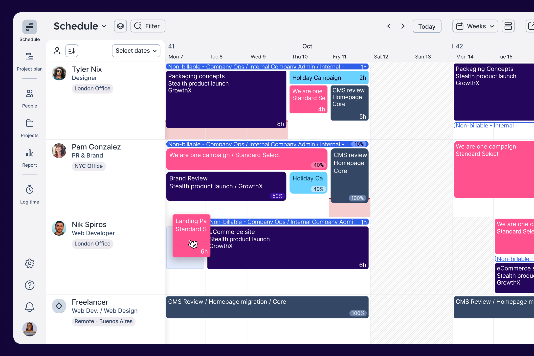
Resource Guru is a specialized tool that focuses entirely on one thing: getting your team’s schedule sorted. It’s essentially a modernized, digital whiteboard that has become a favorite for agencies like Ogilvy and Accenture.
The interface is intentionally simple and brightly colored, designed to give traffic managers a quick visual read on who is free and who is drowning in work.
Its standout feature is the Clash Management Engine. Unlike spreadsheets (which happily let you book a person for 25 hours in a single day), Resource Guru acts as a traffic cop. If you try to double-book someone, it stops you and offers three specific paths:
- Add to Waiting List: Park the unconfirmed booking in a “holding area” (marked with diagonal lines) until you can free up space.
- Add with Overtime: Force the booking through and flag the extra hours as overtime in reports.
- Extend Availability: Quietly extend the resource’s working hours for that day without flagging it as overtime (perfect for “crunch time” that isn’t technically billable overtime).
Capacity planning features you’ll like
- Elastic Overtime: This is a brilliant little feature. If you book overtime and then move or delete that booking later, the system “automagically” removes the overtime hours for you. You don’t have to manually reset the resource’s availability.
- The Waiting List: A visual queue for bookings that don’t fit yet. It allows you to plan future work even when you don’t have the availability confirmed, keeping it on your radar (and dashboard) until you resolve the clash.
- Visual Utilization Tracking: Evaluate capacity levels in real-time with simple, color-coded availability bars.
- Leave Management: It integrates vacations and sick days directly into the scheduler, so you don’t accidentally book someone who is on a beach in Bali.
- Approval Workflows: For larger teams, you can require managers to approve resource requests before a booking is confirmed.
Integrations
Resource Guru integrates with six tools:
- Google Calendar
- Outlook Calendar
- Apple Calendar
- Calendly
- Fantastical
- Zapier
Plus, through the Zapier integration, you can link Resource Guru with over 1,500 other apps, including Slack and Salesforce.
What others say about Resource Guru
“As our resources grew with the company expanding, we needed a tool for managing our resource capacity effectively. Resource Guru provided this. Guru allowed much clearer and more efficient control of our resources.”
—Keith, G2
“Resource Guru is so easy to use, yet so effective when it comes to managing resources and understanding workloads and capacity.”
—Steven, G2
Pros & cons
| Pros | Cons |
|---|---|
| Simple, colorful interface focused on capacity planning | Not an end-to-end solution; lacks features for areas like quoting and invoicing |
| Powerful scheduling features, including an automated waiting list and clash management | No live time tracking (only timesheets) |
| Flexible booking system with fixed, tentative, billable, and non-billable options | Mobile app has limited functionality and can be confusing (according to this G2 user) |
| Easy to implement with a minimal learning curve | Only six pre-built integrations (fewer than other capacity tools) |
| Lower pricing than some tools (starting at $4.16 per user/month) |
Pricing
Resource Guru offers three pricing plans:
- Grasshopper: $4.16 per person/month (billed annually)
- Blackbelt: $6.65 per person/month (billed annually)
- Master: $10 per person/month (billed annually)
Sign up for a 30-day free trial to give it a try.
3. Parallax
Founded in: 2019
Average customer ratings: G2: 4.7/5 (24 reviews); Capterra: 4.4 (53 reviews)
Best for: Digital agencies and software shops that are tired of poor “Sales vs. Delivery” handoffs
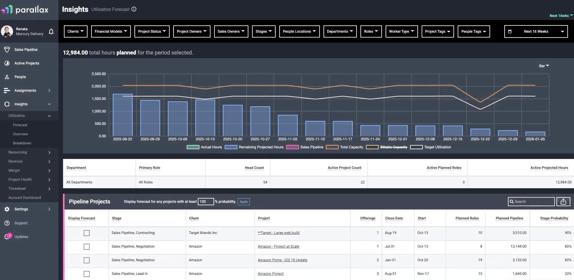
Overview
Parallax markets itself on the idea of “Outplanning Uncertainty.”
Rather than trying to replace your entire tech stack, Parallax is designed to “play well with others.” It integrates with the tools you likely already use—like your CRM (Salesforce, HubSpot) and time tracker (Harvest, Toggl)—to pull all that disconnected data into one view.
The goal is to turn chaos into clarity by linking pricing with planning.
Instead of Sales pricing a project based on a hunch and Delivery figuring out how to staff it later, Parallax helps you model the project before it’s sold. You can see if you actually have the people to do the work and, crucially, if the project will be profitable based on your current utilization.
It also allows you to make hiring decisions “heroically” (their words, not ours) by showing you resource needs months in advance, rather than days before kickoff.
Capacity planning features you’ll like
- Pipeline Integration: It pulls data directly from your CRM so you can forecast resources based on deals that haven’t even closed yet.
- Strategic Pricing: Use historical data to price projects more accurately, ensuring you protect your margins before you commit to the work.
- Hiring Insights: See resource gaps months down the line. This prevents the “panic hire” and lets you staff up (or down) based on actual pipeline data.
- Margin Prediction: Track planned vs. actual margins in real-time, so you know if a project is bleeding money while there is still time to fix it.
- Flexible Tech Stack: If you love your current time tracker or CRM, you keep them. Parallax sits on top. (Though they do offer their own Timesheets and Pipeline tools if you need them).
Integrations
Parallax offers 22 integrations, including:
- HubSpot
- Salesforce
- Pipedrive
- Notion CRM Lite
- Zoho
- Harvest
- Teamwork
- Toggl
- Clockify
- Microsoft Teams
What others say about Parallax
“Parallax is an excellent platform for capacity forecasting and resource planning. The tool provides a level of insight that we previously did not have or had to obtain from spreadsheets.”
—Verified user, G2
“Parallax has been a great tool for our small consulting organization. The tool has transformed how we resource our team to projects and review utilization.”
—Colleen, G2
Pros & cons
| Pros | Cons |
|---|---|
| Streamlined capacity planning with sales and resource data in one view | Steeper learning curve than simpler capacity planning tools |
| AI-generated capacity plans | Slower performance with large datasets (according to this G2 user) |
| Utilization forecasts to help you understand upcoming resource needs | No built-in time tracking |
| What-if scenarios to test different staffing plans and their impact | No integrations with accounting tools like QuickBooks |
Pricing
Parallax charges based on the number of billable team members. Contact their sales team for a custom quote.
4. Teamhood
Founded in: 2020
Average customer ratings: G2: 4.7/5 (63 reviews); Capterra: 5/5 (13 reviews)
Best for: Teams managing multiple projects who need full visibility into workload and capacity
Overview:
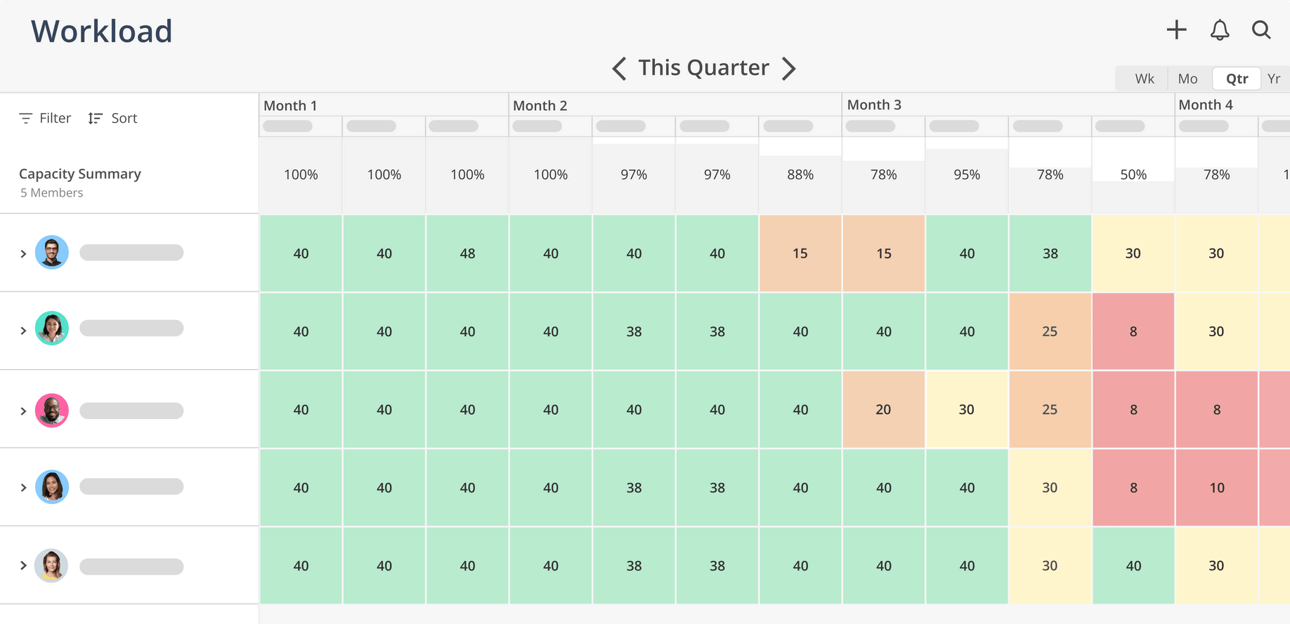
Teamhood is what happens when you decide a Kanban board should actually do something besides just look pretty.
It stands out as a strong option for teams that need deep capacity planning features but also need to oversee multiple concurrent projects without losing their minds.
It’s a visual-first software that focuses on providing a full set of capacity planning features—from workload and time tracking to hourly rates and performance metrics. One of its superpowers is the ability to handle complex, messy projects while accurately managing team capacity across all workloads.
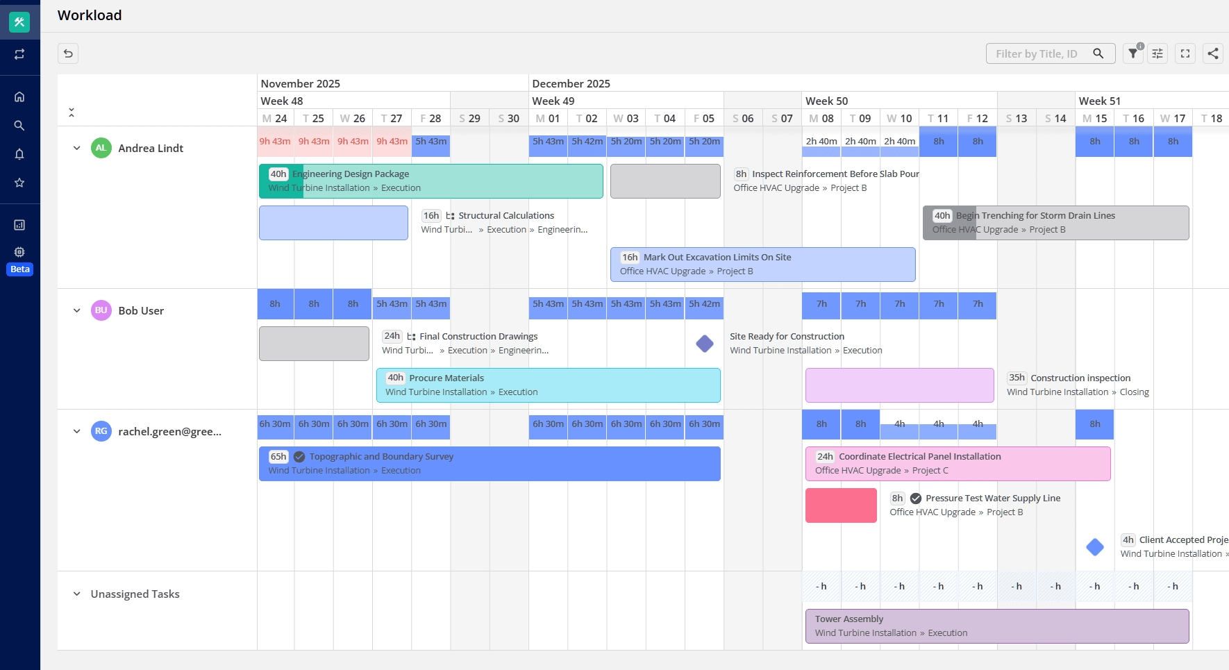
Additionally, Teamhood has a very powerful Gantt chart. You can plan dependencies, adjust schedules with drag-and-drop functionality, and instantly see how moving a deadline impacts your team’s weekend plans.
Capacity planning features you’ll like:
- Workload: Track resources to balance workloads and prevent over-allocation
- Time-off management: Adjust project timelines based on team vacations and leave
- Time capacity vs fact tracking: Track planned vs. actual time usage to manage resource availability
- Gant chart with dependencies: Visual timelines to track project schedules and dependencies.
- Workload report: Insights into team capacity and workload
- Time tracking: Track your time automatically or log hours, add notes for a full view of what was done
- Hourly rates: Add an hourly rate for each team member to calculate the cost of each work item, based on time spent
- Performance metrics: Measure team or project performance with various agile analytics
- Reporting: View tracked time and calculated costs across projects
Integrations:
- Zapier
- Slack
- Microsoft Teams
- Outlook
- SharePoint
- Google Calendar
- Azure DevOps
What others say about Teamhood:
“It looks good, works very well, is intuitive, and is upgraded often to keep up with the needs and expectations (requests) of the users. I have tried other tools (no names will be mentioned) but it is definitely a cut above the rest. Love it!”
—Rozanne, G2
“Teamhood has become my go-to project management tool – and that’s saying something, as I’ve worked with Asana, Trello, MS Planner & To Do, and Smartsheet in various consulting and coaching contexts. What sets Teamhood apart is its rare combination of depth and usability.”
—Barbara, G2
Pros & cons
| Pros | Cons |
|---|---|
| Designed specifically for capacity and workload planning (not just task moving). | You have to use the mobile web browser version, which isn’t ideal for field work. |
| A modern Gantt with drag-and-drop scheduling and dependencies that actually works. | While they have key natives (Teams/Slack), most other tools connect via Zapier or Open API. |
| Track “Planned vs. Actual” time directly on the card without needing a plugin. | It calculates the costs and billable hours for you, but you can’t send the final bill from the tool. |
| Instantly see who is overloaded across multiple workspaces in one view. | |
| Automatically calculates project costs based on custom rates for each team member. | |
| Low learning curve compared to heavy enterprise tools (minimal onboarding needed). |
Pricing
Teamhood offers four pricing plans:
- Free: $0 per user /month
- Professional: $9.50 per user/month (billed annually)
- Ultimate: $19 per user/month (billed annually)
- Enterprise: Custom
Sign up for a 14-day free trial.
5. Runn
Founded in: 2018
Average customer ratings: G2: 4.5/5 (1 review); Capterra: 4.8/5 (30 reviews)
Best for: Professional service companies that need a real-time capacity management tool with forecasts and scenario planning
Overview
Runn positions itself as “Strategic Resource Management” software. It operates on a simple premise: if 90% of your agency’s costs are people, you need a tool that manages them with the same rigor you apply to your finances.
While many tools focus on the day-to-day movement of tasks, Runn focuses on the bigger picture.
It is designed to unite Leadership, Sales, and Delivery around a “Single Source of Truth,” eliminating the version conflicts that happen when every department uses a different spreadsheet.
Designed for IT, software, consulting, architecture, and agency environments, its goal is to move you from reactive scheduling to proactive planning. Instead of scrambling to fill gaps, Runn helps you identify utilization trends and revenue risks months in advance.
Capacity planning features you’ll like
- Strategic Capacity Management: Monitor long-term utilization trends and pipeline impacts across your entire resource pool.
- Placeholder Allocations: Use placeholders to plan future work and quantify hiring needs before you recruit.
- Custom Availability: Set specific work hours for part-timers and contractors to reflect their actual schedules.
- Skills & Location Tagging: Filter staff by skills, location, or experience to quickly find the right person for the job.
- Leave Management: Visualize holidays and time off directly in the schedule to prevent booking conflicts.
- Live Insights: Access real-time data on revenue, workload, and utilization for smarter allocation decisions.
- HR integrations: Keep capacity info accurate by including time off details
Integrations
Runn integrates with six tools:
- AlexisHR
- BambooHR
- CharlieHR
- Clockify
- Harvest
- HiBob
You can also build your own integrations with the Runn API.
What others say about Runn
“Runn is super helpful to be able to adjust and forecast our project planning to see what capacity our staff is at at any given time.”
—Aliza, Capterra
“It addressed literally every set of asks we had in the domain of resource management (capacity, forecasting, utilization) and project metrics (role/person assignment, burndown, and profitability).”
—Gavin, Capterra
Pros & cons
| Pros | Cons |
|---|---|
| Clear, visual overview of current team capacity and utilization | Limited integration options with only six available tools |
| Strong capacity forecasting capabilities with placeholder options | Not an end-to-end solution (missing features like quotes and invoices) |
| Costs less than some more advanced capacity planning tools |
Pricing
Runn has three pricing options:
- Starter: $10 per user per month (billed annually)
- Pro: $14 per user per month (billed annually)
- Enterprise: Custom pricing
Take a free trial of the starter plan or pro plan. Or contact sales to discuss custom pricing.
6. Forecast
Founded in: 2016
Average customer ratings: G2: 4.2/5 (132 reviews); Capterra: (4.5/5) (87 reviews)
Best for: Medium-to-large businesses seeking AI-powered capacity planning and forecasting to make data-driven decisions
Overview
Forecast makes a bold promise: it wants to turn “Pipeline Uncertainty” into “Confident Commitments.”
While most tools just show you who is busy today, Forecast uses Native AI to predict who will be busy next month.
It analyzes your historical data and current pipeline to act as an early warning system. If it sees a project coming down the pipe that usually burns out your design team, it flags the bottleneck before you even sign the contract.
The core of its capacity engine is the Unified Dashboard, which visualizes demand across both Active Projects (what you are doing) and Tentative Projects (what you might do).
This allows you to model scenarios. You can use “Soft Allocations” and “Intelligent Placeholders” to see exactly how a new win would impact your team’s workload
Capacity planning features you’ll like
- Predictive Insights: AI analyzes historical data to predict future utilization and identify resource gaps before they appear.
- Pipeline Modeling: Visualizes capacity against both active projects and tentative pipeline deals in a single dashboard.
- Smart Allocations: Uses intelligent placeholders and soft bookings to model staffing scenarios without locking in resources.
- Demand Forecasting: Forecasts resource demand based on project win probabilities to prevent hiring panics.
- Portfolio Utilization: Provides a real-time, bird’s-eye view of resource efficiency and billable time across the entire company.
- Skill Matching: Automatically recommends the best available resources for specific tasks based on skills and past performance.
Integrations
Forecast connects with 24 tools, including:
- Google Calendar
- Google Drive
- HubSpot
- Microsoft Teams
- Jira
- QuickBooks
- Salesforce
- Slack
- Trello
- Xero
You can also use Forecast’s Zapier integration to sync with over 800 more tools.
What others say about Forecast
“Forecast has really helped us as a design agency understand how much work our team has on our plates, what we have capacity for when planning future projects, and how we may need to adjust costs to cover what it really takes to complete a job.”
—Natalie, G2
“It allows my manager to assign work to the team and see our capacity for the month. It means I am not assigned more work than possible within my working hours. I like that I can move and extend my own assigned jobs to be more accurate if a job is overrunning, etc.”
—Ami, G2
Pros & cons
| Pros | Cons |
|---|---|
| All-in-one project capacity planning tool that includes resource, project, and financial data | Higher price point than other tools with a 15-employee minimum requirement |
| AI-powered project predictions and resource recommendations | Steeper learning curve due to extensive features |
| Flexible resource planning with both tentative and fixed bookings | |
| Visual workload charts and a user-friendly design |
Pricing
Forecast offers custom pricing based on your contract length and number of users (at least 15). Book a demo with their sales team to request a quote.
7. Toggl Focus
Founded in: 2017 (Rebranded to Toggl Focus in 2025)
Average customer ratings: G2: 4.3/5) (41 reviews); Capterra: (4.6/5) (117 reviews)
Best for: Creative agencies, consultancies, and small teams who need to know where their time is going and schedule people without burning them out
Overview
Toggl Focus is the evolution of Toggl Plan—a “no-bloat” tool that merges project planning with deep time-tracking integration to stop you from planning in the dark. It is free for teams of up to five users.
Unlike standard planning tools that rely on guesswork, Toggl Focus grounds your schedule in reality by connecting your plans to actual time data.
It offers a unified workspace where you can switch between Board, Calendar, and Timeline views to manage tasks and workload.
The tool creates a “reality-proof” view of your team’s capacity, accounting for public holidays, time off, and—crucially—how long tasks actually take, helping you prevent burnout before it happens.
Capacity planning features you’ll like
- Reality-Proof Capacity View: Instantly spot who is overbooked or underutilized with a clear view of actual availability that accounts for time off and holidays.
- Integrated Time Tracking: Track time your way (manual, real-time timer, or calendar sync) to ensure future estimates match reality.
- Focus Mode & Pomodoro: Built-in tools like countdowns and Pomodoro timers help the team work in bursts and actually complete what they planned.
- Visual Workload Reports: “Mess-free” reporting that compares planned vs. actual time, giving you clarity on team performance without spreadsheets.
Integrations
Toggl Focus directly integrates with three tools:
- Slack
- Google Calendar
- Toggl Track
The Chrome extension also lets you import tasks from nine other popular tools, including Trello and Asana.
What others say about Toggl Focus
“Toggl Plan offers several features that make it great for project management and team collaboration, such as visual planning, a user-friendly interface, task management, customization, and time tracking.”
—Isaac, G2
“I love being able to see overlapping tasks. It makes complex scheduling easier.”
—Verified user, G2
Pros & cons
| Pros | Cons |
|---|---|
| Uses actual time tracking data to create realistic deadlines, not guesses. | Missing task dependencies (e.g., Task B can’t start until Task A finishes). |
| A “no-bloat” interface that is much easier to learn than complex tools like Asana or Jira. | Good for visual overviews, but lacks deep data slicing for complex analysis. |
| Free for up to 5 users with unlimited projects (better than most competitors). | Some long-term users find the new interface requires more clicks than the old one. |
Pricing
Toggl Focus has four plans, including a free option:
- Free: €0 for up to five users per month
- Starter: €9 per user per month
- Premium: €20 per user per month
- Enterprise: Custom pricing
Get started with the free plan or sign up for a trial.
8. Float
Founded in: 2011
Average customer ratings: G2: 4.3/5 (1,995 reviews); Capterra: 4.5/5 (1,610 reviews)
Best for: Agencies and other professional service teams looking for a robust, visual resource scheduling and capacity planning tool
Overview
Float has evolved from a simple resource scheduler into a comprehensive platform for “profitable resource management.”
While it remains the gold standard for visual planning, it now emphasizes keeping both your people and your profit on track.
And it acts as your single source of truth for capacity, meaning you can finally stop arguing over whose spreadsheet is outdated.
Float’s interface is built for speed—managers can drag-and-drop tasks on a real-time timeline—but now it backs that speed with cold, hard financial data. This lets you compare “Planned vs. Actual” costs so you can ensure you aren’t just delivering on time, but actually making money while doing it.
Capacity planning features you’ll like
- Real-time visual scheduler: A color-coded timeline shows exactly who’s doing what. Drag tasks around and the changes instantly appear for everyone — helpful for agencies that adjust plans multiple times a week.
- Live utilization and availability: Float automatically calculates availability based on contracted hours and time off. Overbooking warnings make it obvious when someone’s workload exceeds capacity.
- Capacity forecasting: You can create tentative projects or placeholder roles to see future demand. It’s useful for identifying upcoming hiring needs or for spotting resource bottlenecks weeks in advance.
- Integrated time tracking: Float’s native timesheets prefill with scheduled hours. This reduces friction for teams and gives managers real utilization data without stitching together separate tools.
- Budget tracking: You can set simple project budgets and compare scheduled hours against cost estimates. It isn’t a full financial module, but it’s enough for basic visibility.
Integrations
Float offers 10+ integrations across calendars, PM tools, and HR systems. You can sync availability from Google Calendar or Outlook, pull project data from tools like Asana or Jira. Additional connections are available through Zapier or Float’s API.
What others say
“This tool is lightweight and easy to learn, making it simple to use on a daily basis. I have relied on it for nearly three years in my work, and it helps me quickly assign time for myself and my team across various projects.”
—Davide C, G2
“Float is a great resource management tool that makes scheduling and planning easy. The interface is simple and easy to use, even for beginners. I love how you can quickly see your team’s availability and avoid scheduling conflicts.”
—Hiren M, G2
Pros & cons
| Pros | Cons |
|---|---|
| Fast, intuitive visual scheduler that teams adopt quickly | Focused purely on resourcing — not a full PM or financial suite |
| Real-time utilization updates and clear overbooking alerts | Reporting is more limited than all-in-one PSA platforms |
| 40+ integrations with major PM, HR, and finance tools | No native approval workflow for resource requests |
| Affordable pricing, easy rollout | Not ideal for very complex enterprise workflows |
Pricing
Float keeps pricing simple. The Starter plan begins around $7 per user/month, and the Pro tier (which includes native time tracking) starts around $12 per user/month. Plans are billed annually, with a slightly higher monthly option. A 30-day free trial is available.
9. Mosaic
Founded in: 2019g2.com
Average customer ratings: G2: 4.7/5 (215 reviews); Capterra: 4.5/5 (44 reviews)
Best for: Creative agencies, marketing teams, and tech companies that want an AI-driven resource planning platform to streamline team collaboration and project planning
Overview
Mosaic positions itself as an AI-powered resource and project management platform. While other tools ask you to manually drag blocks around until the schedule looks pretty, Mosaic uses AI to tell you what’s going to happen before it hits the fan.
By analyzing your active projects and pipeline, it predicts when your team will hit capacity weeks in advance. It’s less about “Where is Steve today?” and more about “Steve is going to burnout in three weeks, let’s fix that now.”
It sits in the sweet spot between a lightweight scheduler and a full-suite PSA, making it perfect for teams who want predictive intelligence to drive their decision-making.
Capacity planning features you’ll like
- AI-driven forecasting: Mosaic automatically models future workload by looking at ongoing work and pipeline data. You get early warnings about understaffing or overbooking before it becomes a delivery problem.
- Smart resource recommendations: Filter by skill, role, department, or availability, and Mosaic will recommend the best people for a task. The AI also flags when someone is at risk of over-utilization.
- Visual project and capacity timelines: A unified timeline shows projects and people in one view. Adjusting dates or assignments updates capacity instantly.
- Planned vs. actual tracking: Teams can log hours in Mosaic or sync timesheets, providing a feedback loop to improve future estimates.
- Budget & performance insights: Because Mosaic pulls in financial and CRM data, you can see utilization, project progress, and budget performance together — helpful for leaders who want a broader operational view.
Integrations
Mosaic integrates with HR platforms (BambooHR, HiBob), finance tools (QuickBooks Online, Xero), and CRMs (HubSpot, Salesforce). It also supports data warehouse connections and has an API for custom setups.
What others say
“This tool allows quick setup and fast ROI (reporting and businss insights) and it’s really important for small teams that do not have significant resourced dedicated for FP&A.”
—Ken T, G2
“Mosaic has been an awesome tool in streamlining our finance month-end and reporting functions. The automation of reporting and the integrations available with our existing systems have reduced the time and effort spent on manual processes, particularly with managing multiple entities that require consolidation.”
—Verified User, G2
Pros & cons
| Pros | Cons |
|---|---|
| AI-powered forecasts that highlight staffing risks early | Reporting depth is still developing compared to mature enterprise tools |
| Smart recommendations for allocating people based on skills & availability | Smaller number of native integrations |
| Clean, visual interface with drag-and-drop scheduling | Fewer customization options for dashboards |
| Strong onboarding and support | Pricing isn’t transparent and may be higher for larger teams |
Pricing
Pricing is quote-based, with third-party sources listing starting rates around $9.99 per user/month (annual billing).
10. Supervisible
Founded: 2024 | Best for: Agencies and professional services firms seeking visual capacity planning with built-in profitability tracking
Overview
Supervisible is a modern capacity management platform built specifically for agencies that need to balance team workload, project profitability, and resource allocation in one place. Where many tools treat capacity planning as an afterthought, Supervisible makes it the foundation—giving agency owners, project managers, and team members real-time visibility into who’s available, who’s overbooked, and whether projects are actually profitable.
The platform takes a transparency-first approach, with color-coded workload indicators that flag potential burnout before it happens. It’s particularly strong for agencies managing multiple clients with overlapping projects, where the difference between a profitable quarter and a disastrous one often comes down to resource allocation decisions made weeks earlier.
Capacity planning features you’ll like
- Visual workload dashboard with color-coded utilization (green = optimal, yellow = approaching capacity, red = overallocation risk)
- Week-by-week capacity grid for granular resource allocation across quarters
- Agency rate tracking that calculates your effective hourly rate per project (Project Value ÷ Total Hours)
- Skill-based resource matching to find team members with the right capabilities for each project
- Automatic time-off impact that adjusts capacity calculations when team members are on leave
- Multi-project visibility to identify scheduling conflicts and overlapping assignments
- Profitability alerts that flag projects falling below your minimum viable rate
- Team workload overview showing capacity utilization percentages across your entire organization
Integrations
API access for custom integrations.
What others say
“We finally stopped overcommitting to projects because we can actually see our team’s capacity in real-time. The profitability tracking alone paid for itself in the first month.” – Orlando Osorio, Founder at Meaningful
“As a PM managing 12 projects simultaneously, Supervisible is the first tool that shows me workload conflicts before they become fires to put out.” – Francisco Hernández, COO at Moonshot Partners
Pros & cons
| Pros | Cons |
|---|---|
| Purpose-built for agencies and professional services | Currently in private beta (waitlist required) |
| Combines capacity planning with financial tracking in one view | Integration ecosystem still growing |
| Clean, modern interface teams actually enjoy using | Less suited for non-agency use cases |
| Proactive overallocation warnings to prevent burnout | Pricing not publicly available — contact required |
Pricing
Private beta with personalized onboarding currently available. Contact for pricing.
Could Scoro be the right capacity management tool for you?
Could Scoro be the right tool for you?
Look, we’ll be honest: if you just want a digital whiteboard to drag tasks around, plenty of tools on this list will do the job perfectly.
But Scoro isn’t just about making sure your team is busy; it’s about making sure they are profitable.
Don’t just take our word for it. DGA Group transformed their capacity planning and overall business with Scoro. The global consultancy increased team utilization by 20% and boosted project profitability by 33% by gaining real-time visibility into team workloads and capacity.
Want to see how you can optimize your team’s capacity and keep projects profitable?
Try Scoro free for 14 days.